Started off trying to create perhaps more typical editorial concepts with visual metaphors and juxtaposing elements combined together to describe McCarthy’s work. Firstly focussing on the motif of horses, combined with imagery relating to the themes and places written about, such as religion, life & death and barren expanses of American landscape. Really drawn to juxtapositions and contrast, and it was a good challenge to link two ideas into one coherent image. Using motifs and visuals that at first look meaningless but have deeper meanings can be very effective for editorial work, especially if those meanings become clear in the copy paired with them. However forcing this approach to editorial can create obvious and boring work, and although I want my work to have meaning, I don't want it to look predictable. Letting anything come out during the ideas stage is valuable, no matter how bad or good, and then analysing afterwards. These first few ideas were not so strong or exciting so I dropped them, even if they had some potential. Symbolism is another really fascinating and important part of my practice. I love imbuing meaning in a subtle way through the imagery that I am working with, avoiding force feeding a viewer what is being said or communicated. Mexico and American’s histories and traditions is full of symbolism also so it was appropriate to pursue this direction. McCarthy’s work deals with topics of life and death paired with other ideas, so that was something I wanted to include and communicate with my pieces. There is a Mexican card game called Loteria which is a game of chance which I feel evokes McCarthy’s work well, and my work was becoming more reflective of tarot card’s naturally with ideas that were coming up. Using a few simple symbols I communicated the themes explored by McCarthy as well as one of the anecdotal stories in one of his books; the sun represents life, the moon represents death, the horse shoe for chance and the church to explain the story of God punishing human’s bad will. Lino cuts were immensely rewarding, wrestling with the process is valuable and the traditional nature and tone of voice of analogue printing pairs beautifully with McCarthy’s work; dark, unforgiving, ceremonial and laced with tradition and history.
Tuesday, 17 October 2017
Thursday, 5 October 2017
Study Task 2 - Editorial Illustrators
DAVID PLUNKERT


- 'Flat' visual perspectives
- Minimal colours for effect
- More ambiguous than obvious visual metaphors
- Probably digital, subtle noise and textures, strong shapes
DAVID FOLDVARI


- Simple ideas/images, powerful messages
- accented red colour
- black and white contrast, dark
- texture
- No really complicated metaphors, straight forward imagery
Tuesday, 3 October 2017
Study Task 1 - About the Author Zine
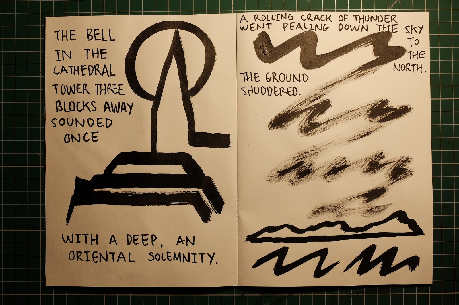
Enjoyable, quick project to start responding more to author's work. Wanted to approach it differently to summer work, make it visually different, and not spend too much time. Picked quotes at random from books and visualised in roughly 5 strokes/lines. Simplification and reduction was key and challenging but restriction brought new imagery and thinking. Communicate with less.


Subscribe to:
Comments (Atom)