Monday 31 October 2016

Illumination - Editorial

This brief was most probably the most difficult and challenging one so far. Just the process of coming up with visual representations of a body of text that effectively communicate the overall themes of the piece, draws a reader into reading it and is also visually appealing and clever, all at once. It was a definite learning curve but not without it's struggles!

Initial Studio Task - SINK


The first task had my head in a spin, and really demanded deeper thinking, in an attempt to represent the word in interesting and perhaps more subtle ways. Looking back at this sheet I don't think my ideas were terrible...perhaps just badly drawn? The ideas are one thing, but then translating them onto a page without reference?! tricky stuff. The small frames were also an added challenge, trying to simplify each image right down to work within the tiny space. 
This is a task I should retry and attempt to pull off better. I really learnt the struggle of translating written word into visual imagery that is thought provoking and interesting, and that I find that struggle very apparent...

Internet Trolls Beware

With an article about technology, I really wanted to sway away from the most obvious responses, that being images of phones or computers, despite 2 of my 3 finals containing exactly that; I should probably learn to stick to my initial intentions throughout each project. I also struggled to not be figurative with my responses and it became very apparent with my first few roughs that was a direction I was heading in. I think my brain might just work that way though, initially at least. I think it is an important skill to learn to think in different ways other than figuratively. Perhaps it is because images of people are so familiar and recognisable and relatable that causes them to immediately spring to mind, or maybe a lot of the work I like contains human forms? who knows, but it's something I am conscious of.

A few reasons why my rejected roughs didn't work:
  • Too complex; the scenes containing several people were just not accomplished or refined enough to be clear and meaningful, instead they ended up busy and confusing. Plus they were too typical and bland,
  • Misleading; some just sent the wrong messages about the piece, hinting at concepts and themes totally unrelated, mistakingly included in trying to portray a relevant message. I perhaps didn't consider every side to the article in these, or perhaps honed in on one side with no consideration for the overall theme,
  • Wrong tone of voice; the article's tone was portraying the change in legislation as a positive thing to protect internet users, whereas some of the roughs suggested a totally opposing opinion, focussing more on the loss of freedom of speech as opposed to the positive safety aspect gained from the changes. I think to combat this I need to decide a view point on the article, or portrayed by the article, and constantly cross reference them with the work I am making to ensure that they align with each other.
I wrestled with a multitude of ideas and concepts and images within my roughs for quite a lot time and produced quite a lot of different ones. It was interesting then, that for my 3 finals, I chose to develop some of my earlier roughs...perhaps the best ideas happen early on? and the rest are just brain workings that need to just be put down on the page to free them? And perhaps when compared, they make the earlier roughs look half decent? 

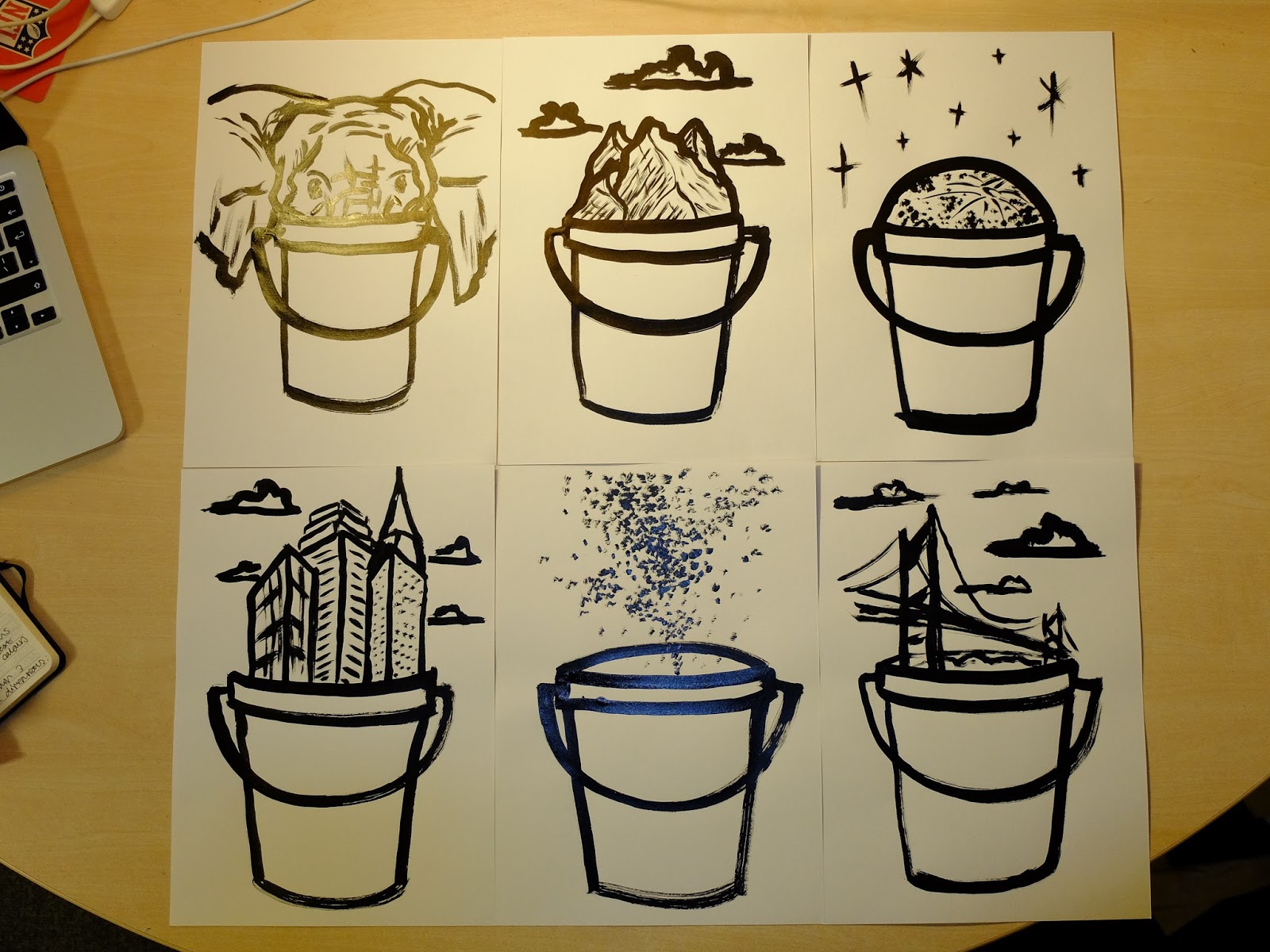
In this way, maybe my finals were just the best of the worst? I wasn't overly happy with any of them, for their imagery or concepts as a whole. I am pleased with some of the images I created, such as the representation of bubble wrap using rolled out ink and a pen lid as a stamp. I am also pleased with the buffalo as a drawing, the combination of loose tip-ex marks and finer pen lines; they have a certain energy about them. 


Things to Work on:
  • Use of 'real estate' and composition, using the space available in a more effective and useful manner,
  • Keeping ideas and images simple and to the point, but clever and effective in their purpose,
  • Thinking more deeply and imaginatively about how to communicate and represent ideas, themes and concepts visually. 


Chris Niemann

After looking at some of Niemann's work I was inspired to try and incorporate 3D objects into my drawings, similar to how he does in his, to create an interesting relationship between object and line.

I wish I had drawn the face better but it's an interesting concept, to see objects as not only reference material, but direct source material in image making. Especially when the object itself has a specific and thought out purpose and link to the concept.

Thursday 20 October 2016

Visual Language - Line Quality

Line quality is something I always notice in people's work, although never consciously. I feel it is often overlooked how important line quality is to the make up of an image; it truly is everything. The way a drawing is created and received is solely down to the quality of the line that forms it.
I find mark making exercises very useful as it always refreshes me on the sheer variety of marks that we are capable of creating, reminding me of the many different ways that I can make an image. I find it is very easy to get stuck in a routine of drawing a certain way, with a set line quality without ever considering how else I could be drawing, usually in ways that could be more effective. The slides really refreshed my inspiration too along with the quotes, motivating me to really want to try and draw more, every day, to really progress my image making abilities. At the moment I am struggling slightly with idea creation and even when I do get an idea, the translation of that image from my head to the paper. But I believe if my drawing skill was greater then this would be less of an issue.


I really enjoyed this studio task, although did find that at a point I was struggling with coming up with new line qualities to explore. Changing tool was an obvious solution but then with some, the nibs only allowed for a limited amount of variation. The brush outcomes are my favourite, I love the texture that is created from the bristles, the unpredictability of the medium makes it exciting and ever changing. No two marks with a brush are the same and that is something that motivates me to create more. 

From these line quality explorations I created some portraits of Alex in an attempt to put them to use. This is the most effective one in my opinion, created by dipping the wrong end of a pencil in ink. The variety of line weight and quality made by doing this is what makes the image so interesting; the pencil is not at all absorbent, so only holds a little amount of ink each time, meaning the line fades out quite quickly. These tapered lines are very expressive and always unique, similar to the brush but aesthetically very different. The fact that the tip of the pencil is only small means the line weight is quite light also, making quite a delicate image overall.

Wednesday 19 October 2016

Visual Language - Ska

For the visual language studio brief I picked ska music, thinking I could experiment with portraits of skinheads and that distinctive style. The first image I made was the centre portrait. Working quick with a marker straight onto paper made proportions and head shape very difficult to get down accurately, and although this particular image has character, I was disappointed with how it turned out. I feel it looks badly drawn, the imperfections adding nothing beneficial to it. I want to get better at portraits and people, especially when drawing straight pen to paper. My favourite drawing is the skanking man at the bottom. I really love the energy he has and his proportions were more accurate, creating an believable body form, the shape of him dancing making an interesting image. I could try and experiment with exaggerating certain parts of this figure, emphasising his movement and energy.

I took these dancing men further and scaled them up, again working quickly with just a marker. I believe the most effective outcome was again the most accurate, the bottom right figure depicting a likeness to a real life human form. In the others, the off proportions take away from the personality of the character, the bottom right being too heavy with small legs, and the centre top also having a heavy torso and large head. These inaccuracies did nothing in portraying the movement or action the figure would have been going through. I also tried to redraw the previous portrait which turned out better in my opinion, the face shape looking more natural and the absence of facial features creating an intimidating presence many feel towards skinheads. 

Taking the skanking men one step further I adopted a square brush and ink. After watching a video of Picasso drawing a bull with only a few strokes, elegantly capturing the form of the creature with simple and swift movement  I was inspired to try a simple thing. Each part of the figure is created using one stroke, and although they have ended up taking on a stick man form, the simplicity is somewhat appealing. In all I wasn't too happy with these but they were an interesting experiment none the less. Makes me appreciate the actual difficulty in capturing a form in as few lines as possible. 

Staying with the brush and ink and fast drawing, I made these images of instruments with a rounded brush this time. I really love these, they are by far my favourite outcomes from this whole little project. I think the brush strokes give them an energetic quality, particularly the shape of the saxophones, and I believe a viewer can almost see them being played by a dancing musician on stage among a ska band. In terms of creation, the brush and ink lends itself to loose image making and the inconsistency makes for an exciting process. I used the same reference image for most of these, yet each outcome is wildly different, the brush making different lines each time. 
I plan on experimenting more with different lines qualities for the extension task, as well as trying to improve my portrait and figurative abilities. Capturing likeness and human form in general is a great task and one I am determined to master. 

Monday 17 October 2016

Typology Poster - How to Reinvent a Bucket

From my ideas bang and cleaner idea developments, I refined my images, making several copies of each. However I made the decision to use a brush pen for the contents of the bucket but keep the marker for the actual bucket. I feel like the mix in weight lines and the contrast of the two creates a nice balance to each vignette; the heavy weight marker lines of the bucket grounding the finer, lighter one work of it's contents. However after enjoying using brush and ink in our visual language sessions, I had a go at quickly creating some outcomes in that media, drawing from my refined images but in a looser way.


In general I was quite pleased with how these turned out, especially as they took hardly any time to make but were effective in their looseness. As an act of creation, the brush and ink is so enjoyable, allowing me to work fast and not worry about the inevitable vary in line weight, which gives the media it's beauty. I love the fact that light lines can still be used where necessary, in the mountains for example or on the moon, which creates a nice relationship between detail and form, as well as tone. As much as I enjoyed these and liked the outcome, I went against using it for my final poster. I felt like the brushes effectiveness was based on its thickness and size, whereas I would have had to scale down these drawing for my final. I feel like these on a smaller scale would risk being messy and not clear enough, whereas with the brush pen, the same quality can be achieved in a much more controlled way. It is interesting how the two tools are essentially the same, yet the experience and outcomes of using them are widely different...


And this is my final poster. In general I am very happy with how it came out and I believe I effectively translated what I wanted it to look like from my head onto paper. The mix of light grey tone and black line work creates a bold quality to it, one which as a lot of people mentioned in the crit, reflects that of a printed piece of work, possibly screen print. I'm not sure why but there is something very aesthetically pleasing about layering line work in this way, the combination of lightly coloured shapes and strong, detailed line work, and is something I admire in many other's work. Also the fact that the colours behind are not confined by the lines, but instead work as separate elements of the whole. One thing I did find difficult was the quality of my final drawings when compared to their previous versions. I prefer a lot of my refined ideas drawings over the ones on my final poster and feel like something was lost in drawing them again. This was probably due to the fact that I drew straight from my previous drawings instead of from the original reference material, in a way making the finals something of a copy of my other drawings. This is an interesting concept though and one which I could explore further; by drawing the same drawing again and again and again, how far can I get it from the original source material? Akin to when you photocopy a print out over and over, the quality decreasing each time it passes through the photocopier. 
Something that Matt and Jamie mentioned was graphic design being prevalent in my final poster, in the layout and I think the use of text and image. Typography is something I am interested in and am very keen to continue to incorporate into my illustration work where necessary and appropriate. 

Monday 10 October 2016

100 Ideas Bang - How To: Reinvent a Bucket

For my typology how-to poster, I ended up with the subject of how to reinvent a bucket. I found the initial ideas quite difficult; the topic itself is very open-ended and doesn't even particularly spark off many visual ideas right away. I resorted to more obvious solutions, such as the heavy night idea and the emergencies. The rest of these initial sketches were quite broad and random, and none of them really excited me too much. I think this was a combination of the actual ideas themselves, coupled with the actual images and how the ideas were executed; drawing from my head proved challenging and unfulfilling to start with. My favourite off these first sheets is the take-away bucket, as I love the simplicity of adding a handle to a coffee cup and calling it something else, as well as aesthetically I feel it works well with the similarity of shape between the cup and a bucket.


When having a discussion with Jamie about my initial responses, he eluded to the success of the firework idea, the simple nature of the image and idea but still visually effective. I soon realised that I was trying too hard on the idea side of the brief, trying to force humour and absurdity when there wasn't much reason to, instead he explained how it can be a really basic idea but executed well. With this, I decided to explore the idea of keeping the bucket consistent, but instead simply just changing the contents, taking 'reinvent' a little less literally, and focussing more on the aesthetic approach to the final poster than forcing a clever or humorous concept.


For my first development ideas with the consistent bucket idea in mind, I chose very random things to fill them, using what was around me and what I could picture in my head. They was very little thought or conscience to it, although I did try to consider what would visually work well, considering the shape and form of the contents. The best of these were the moon, the heads, the mountains, the rabbit, and the palm trees, to name a few. From these I tried to think what sort of theme I could take and use in order to bring them all together, and I came up with the idea of a bucket storing un-storable items. I feel like these responses have the most substance to them, having a humorous quality, if only in a subtle way.


The next step I felt was to start thinking more consciously thinking through each idea. Not all of these further outcomes are particularly un-storable, but the idea was to work in rows, pushing one concept and making variations as a way of exploring each further. I think of all my outcomes so far these were by far the most successful. I love the consistency through each row, the organisation and uniformity creating a coherent body of work which lends itself to the gridded layout of the whole sheet. I particularly like the dynamic nature of the structures, namely the bridge and pylons, and the way the roofs and lines can layer onto of each other to create a busy form rising out of the buckets. I also like the heads for their comedic element, plus the way they work as a little series. I am going to push the heads further though, working more from reference material and pushing the facial expressions further. As a whole sheet the middle one is my favourite, the subtle changes in image each time is successful in series, such as the houses and insects. With that said the broad concept of ovals on the top line I feel also works well in a less obvious way, keeping the concept a little more ambiguous even if not technically un-storable. 

Today I got good feedback on my outcomes, many people liking the aesthetic choice to keep the buckets as a constant and just changing the contents. There was some discussion around media and titles also, which I have come away and thought about through making some rough layouts and I seem to have reached a point where I am more or less confident in how I am going to execute the final poster. I am going to have 6 rows of 4 different concepts within the un-storable theme in a gridded fashion, such as these last 3 sheets. I want the title to be separated into letters, in a light tone behind the buckets, one letter per bucket, to spell out 'how to reinvent a bucket'. In terms of numbers, this works perfectly with 24 buckets, and I feel like the layering of dark lines on a lighter shade will be very effective. I still have yet to further develop the actual images themselves, but I feel like I have a good idea of what steps to take from here to produce the poster I have imagined and roughed out on A4. It feels really good to have a direction to go in and crack on with that I am happy with. 

Thursday 6 October 2016

Drawing from Observation

I believe there is an immense amount of value in drawing from observation and feel that there is no better way to improve my drawing ability than to sit in front of a real life 3D subject and draw it. To me, the main reason for this is because drawing from life forces you to think the whole time, actively studying and assessing your subject, some elements of which are not easy to make sense of, for example perspective. On a photograph there are usually perfectly vertical and horizontal borders, giving you a point of reference for the angles on which the form of the subject falls. However in life there are no such borders, requiring you to really study and interpret these angles to get them down properly. This is part of the overall challenge of translating a three dimensional form into a two dimensional image, the main reason why drawing from life is so difficult.
As someone who can be a perfectionist in their image making and has always strived for accuracy in the past, I think drawing from life also gives me a more organic approach to drawing. As mentioned, drawing from photographs allows you the time to sit down and over-stress the details and I have always found myself unconsciously copying the image in a passive manner. However when I am sat in front of a physical subject, the near impossibility of copying what my eyes sees onto a page with perfect accuracy allows me to loosen up and focus more on capturing the essence and main elements of my subject, usually resulting in a more human outcome out of necessity.
Composition and the relationship between all the elements in a drawing also differs when drawing from life compared to from reference. Because of the physical nature of these elements, space exists in between them and they sit at difference distances from your viewpoint. In drawing this, the space cannot exist physically, but instead has to be flattened and translated into two dimensions. This again requires you to constantly analyse your subject in order to figure out this space and how to suggest it in your drawing. For example in the studio session on Tuesday, the leaves of the plants all sit around and exist among each other and the challenge was to portray this into a drawing, to suggest the depth of the subject and the relationship all the leaves had with each other.

Drawing from reference is also extremely valuable, even if not personally as much as from observation. Reference allows you to make an image of something correctly, to accurately depict a subject in a recognisable way and avoid guessing from visual memory. As evident from Tuesday's memory studio task, my visual memory is not very good, so sometimes drawing from my head with no reference can prove frustrating and difficult, resulting in an ineffective outcome. Without directly copying a reference image, it allows you to communicate effectively the idea in your head, whilst still having the freedom to play around with the image, exaggerating or reducing parts, for example, to suit the purpose of the work.


Here are my images drawn from memory. It is interesting yet confusing to see how the more I drew the same photo, the worse the outcomes became (the first to last going from left to right on both rows). I think this could have been because on the first one I had an idea of the overall subject, but not so much the details, so I was able to depict an example of what the subject was, that is a side profile of a girl with a head scarf, but not an example of the actual photo. So the more drawings I did the more I focussed on the actual elements of the photograph, but due to my lack of memory these turned out less like what I was depicting overall, but instead misinterpretations of select details. It is also interesting to see how your brain fills in the gaps of what is there. Every outcome is similar in that it portrays the subject, but widely different in the way they do that. The dimensions change dramatically as well as the actual form of her face, sometimes to be further from the photograph, despite having seen it again several times. In comparison to the final, the first images are a lot more flat and less dynamic, even the head scarf looking less true to life. To remember the form and composition and tone and depth of an image to translate onto paper is a very difficult challenge.

I am quite pleased with how my final image turned out. Although not strictly accurate when compared to the photograph, I feel it effectively captures the nature and emotion of the girl. I impressed myself particularly with the tone as the quality of the ink when diluted with water creates a really expressive and textured mark. I chose to leave out the detail of the headscarf and clothing, focussing attention purely on her face and not risking the whole image blending into itself with no real focus. I would have perhaps liked to have captured the form of the subject's face better to create a portrait of that specific person, as opposed to a creating a random face merely referenced from the photograph. The final outcome may have also been more effective had I been more direct and accurate with my lines, although I do like the way that the mistakes still show, making a more human result.


I feel like I learnt a lot about my approach to drawing again with doing these observational drawings of my plant. As usual, I started by creating a very tight, regimented depiction of what I was looking at, staying small in scale and attempting to accurately build up the leaves into a final image (top left). I was trying to essentially copy the subject I was drawing, without much consideration for how else I could capture the plant in a more interesting way. It took me most of the session to break free from this process still, with each one trying to loosen up and let go of the constraints I had set myself, but not really succeeding until near the end. The looser pieces are actually my favourite too and by far the most enjoyable to execute. I feel they have so much more life than the more refined images, they capture the plant as it is, a living, moving, growing being, as opposed to the structure depicted in the earlier drawings. Also the aforementioned space that exists between the leaves is also felt more in these looser drawings, and they seem to fall more in relation to each other creating a more dynamic image with depth.

These are the drawing by some of my peers which stood out to me the most. Something I truly admire is the ability in all three to create an 'accurate' and true depiction of a plant, with detail and thought out lines, but without compromising on looseness or having an organic outcome. Take the blue image on the right for example, not only is the monochrome blue highly appealing, the way the leaves have been suggested with no fixed or regimented outline creates a very delicate but bold drawing. The use of shape is particularly effective, giving the plant a more physical portrayal. Even the left hand drawing despite the solid outline still retains a delicate quality to it, the light weight of the lines and subtle uses of lighter tones giving it more structure than the blue drawing, but still as careful and considered. The bottom drawing, although again very different, still uses line and shape in a powerful way. The lines themselves are heavier, but so expressive and energetic and when paired with the areas of tone create lovely contrast. The best part of this particular image is the variety of marks and techniques used to build up the leaves; some are bold and detailed, others fade and curl away in the background, and others just merely suggested through shade or a gestural line.

Tone is also a really important element of all three, and the layers of tone, shape and line work are what immediately drew me to them as a set. Tone is used to suggest, as in the top left and bottom images, as well as create powerful depth and physicality, as in the top right and bottom images. It makes for a more dynamic image, in that it adds detail effectively but subtly at times, adding a new element and layer to each image. The ink proves amazing at allowing the creation of such a variety of shades, layered beautifully.