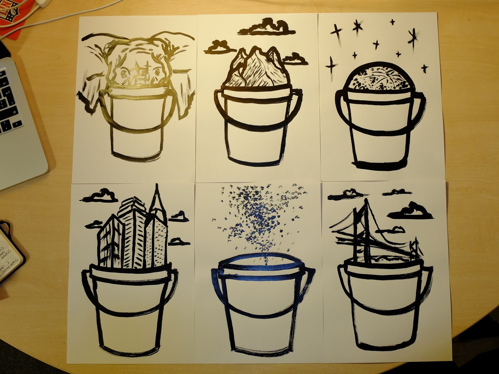
In general I was quite pleased with how these turned out, especially as they took hardly any time to make but were effective in their looseness. As an act of creation, the brush and ink is so enjoyable, allowing me to work fast and not worry about the inevitable vary in line weight, which gives the media it's beauty. I love the fact that light lines can still be used where necessary, in the mountains for example or on the moon, which creates a nice relationship between detail and form, as well as tone. As much as I enjoyed these and liked the outcome, I went against using it for my final poster. I felt like the brushes effectiveness was based on its thickness and size, whereas I would have had to scale down these drawing for my final. I feel like these on a smaller scale would risk being messy and not clear enough, whereas with the brush pen, the same quality can be achieved in a much more controlled way. It is interesting how the two tools are essentially the same, yet the experience and outcomes of using them are widely different...

And this is my final poster. In general I am very happy with how it came out and I believe I effectively translated what I wanted it to look like from my head onto paper. The mix of light grey tone and black line work creates a bold quality to it, one which as a lot of people mentioned in the crit, reflects that of a printed piece of work, possibly screen print. I'm not sure why but there is something very aesthetically pleasing about layering line work in this way, the combination of lightly coloured shapes and strong, detailed line work, and is something I admire in many other's work. Also the fact that the colours behind are not confined by the lines, but instead work as separate elements of the whole. One thing I did find difficult was the quality of my final drawings when compared to their previous versions. I prefer a lot of my refined ideas drawings over the ones on my final poster and feel like something was lost in drawing them again. This was probably due to the fact that I drew straight from my previous drawings instead of from the original reference material, in a way making the finals something of a copy of my other drawings. This is an interesting concept though and one which I could explore further; by drawing the same drawing again and again and again, how far can I get it from the original source material? Akin to when you photocopy a print out over and over, the quality decreasing each time it passes through the photocopier.
Something that Matt and Jamie mentioned was graphic design being prevalent in my final poster, in the layout and I think the use of text and image. Typography is something I am interested in and am very keen to continue to incorporate into my illustration work where necessary and appropriate.
No comments:
Post a Comment