Three briefs - Hookworms Poster, Penguin Book Cover, Socio-Political Poster. Each brought their own set of challenges and processes. Juggling three different briefs at once had its challenges also, teaching me that time management and balancing my focus is essential.
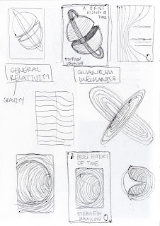
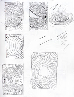
I enjoyed mocking up the Stephen Hawking book cover, playing around with shapes, dissections, simplification, trying to achieve a diagrammatic image that could be universally appreciated, based on the themes of the book, not directly depicting them. I felt engaged being loose with my sketches trying to create something striking and bold that was informed by the book’s content. Sticking to one aspect, black holes, I was able to be exhaustive in my sketches and focus on creating as many relevant possible variations of one idea; with the book being so ‘deep’ and extensive with information, it helped to focus down. However, I found it difficult to then make the final book cover. I was unsure which medium to use and didn't really experiment with this enough, in the end adopting for a cleaner line with a scanned in lino block. By the end I really neglected it, putting in the groundwork at the beginning with the sketching but then not keeping up the momentum. The layout of my final cover is unimaginative and stiff. The subheadings don't fit in the box well and the overall design looks amateur and rushed. Next time I would spend more time on the final layout, and give myself some distance from it to maintain an objective and informed opinion.
There were a couple potentially successful concepts in the sketches for the socio-political poster, but none that jumped out at first. For this it was a case of forgetting about it for a while and letting it mull over in my mind until an idea came, that of the ‘Return to Sender’. Going typically figurative and ‘accurate’ at first, the initial sketches for this were very stale. Even though the concept was reasonably strong, the drawings being based on photos of my hand were stiff and uninteresting. I then remembered that it doesn't have to be a realistic hand but can be drawn differently to work in the image, so the hand became creepier and more appropriate. I am pleased with the final, the colour being the only real point of contention, being unsure of how effective it is just having the red background.
The Hookworms poster was a good lesson in having free-reign over the ideas and images. I found this harder than expected, having little to go off or pull from for ideas. Although I think some of the house roof ideas could have worked, in practice they didn't feel very ‘me’, causing me to go back to sketching and working a bit looser - When an idea isn't working, don't force it…start over. Layout was again a real struggle and took a while to sort out. Even after many versions I am still unsure at the success of the final layout. Something I really wish to work out throughout level 6 more is composition and layout, as I worry it could let me down in future briefs.


No comments:
Post a Comment