Saturday 1 December 2018

7X7 no.1


Editorial illustration for a Guardian article about Dutch rail paying compensation for transporting Jews to nazi death camps.

https://www.theguardian.com/world/2018/nov/28/dutch-rail-pay-compensation-jews-nazi-death-camps

Saturday 17 November 2018

Reflective Post 1

At this stage I am unsure of the specific projects that I am going to carry out for 603, although I am aware of my aims and hopes for this module. I want to create work that is honest, serious and valuable, focussing on reportage/editorial work, mainly drawing on location from life. I want projects that can challenge my story telling abilities, and give me the opportunity to really focus on how I make work, what that work looks like and where it fits into contemporary illustration industry. This main focus of this module for me, to really develop my image making to a point where I have a successful approach to answering briefs or completing projects, and where the work is recognisable and distinctive of my own. With this, however, I don't want to put myself in a box, but instead create an imagine making method that I can apply to a variety of briefs, problems and projects, whether that is reportage work, editorial or book covers. This will come with defining a manifesto of sorts, a tone of voice and visual literacy that is my own and that works best for me.

The themes I would like to cover are politics, activism, community and place, allowing me to learn about and document current affairs, preserve untold histories and tell untold stories, giving a voice to unknown communities. I see my work coinciding with documentary photography and journalism. A lot of the projects I undertake I suspect will be self-directed. 

Going into the group crit I had a few ideas of the projects or topics I would like to do projects about, these being:

  • WY Fire Service, documenting their struggles with public sector cuts, disrespect from the public and telling their often untold stories.
  • Fracking, visiting protest sites in Lancashire, telling the activists stories and highlighting the negative aspects of the industry.
  • Housing Crisis, visit communities struggling with housing issues due to governmental cuts
  • Human Interaction, practice drawing people, telling stories and capturing emotions, similar to the practice of street photography, documenting human interactions and relationships

Alongside these, there are a couple of live briefs I would be interested in submitting to:

  • BiCeBe poster competition
  • Penguin design awards 

Feedback from Crit:


  • Look into Leeds List website, see if they want illustrations to accompany articles they post
  • Consider construction as a subject matter, ongoing building works within city centres
  • Pick projects that allow development of work, challenge yourself 

Tuesday 23 October 2018

Who Am I? - Presentation


- Slightly confident starting point - themes and subject matters and reasons
- Direction - focus on practicing and expanding visual literacy and tone of voice, capturing moments, places, people to improve process and build confidence with working
- Have more specific focus when approaching reportage projects - starting idea to explore and investigate upon arrival

Wednesday 9 May 2018

Studio Brief 2 - Individual Practice, Community Gardening

I found studio brief 2 more difficult than I first thought I would. In my practice, writing my own briefs works well for me and is something which excites me the most about illustration. I love undertaking projects which call for me to visit a new place, talk to new people and seek out the stories they offer to make work about. However, I think this particular project was a bit of a wake up call in the challenges this kind of work poses, and also in my lack of experience with them. I started off fairly confident with my idea of community gardening, and had the locations to visit to make work from, but having a three week break over easter away from Leeds and these locations was a massive spanner in the works, meaning I made no relevant work over this time which not only set me back but also knocked my confidence. This was fuelled by a few very unfruitful trips to the locations, where none of my drawings worked or turned out how I had hoped, and I disregarded recording the stories I was hearing about and the potential source material that was around me. I struggled with juggling meeting the people, engaging with them and what they were doing, whilst simultaneously making work and recording everything I experienced. This is purely down to inexperience in this kind of work, and will take time to build up a practice which allows a successful balance to ensure I come away with plenty of work and material whilst also having engaged with the subjects.


Another potential difficulty with reportage work is the final illustrations. The very nature of the practice demands observational drawings, which can often end up as scribbles when the people being drawn are constantly moving and life is happening around you. I find this offers a charm to the drawings, and an exciting challenge when creating them. The race of capturing what is seen before it moves makes for very dynamic and exciting images, where the movement and energy of the subject is captured and recorded through multiple lines and versions of the same subject. However, due to their scribbled nature, these drawings do not always lend themselves to final illustrations. The challenge then becomes how to take these drawings and make them final, whether that involves editing them, redrawing them, simplifying them etc whilst maintaining their sensitivity and energetic charm. Through this process the story can get stripped from the images as they become more flat and less energetic, which I think is what happened to the people in my final illustrations. 


Something I really wish to develop more in my observational reportage work is omitting the elements of a scene which are not important. I have a tendency to try and capture everything I can see, which not only takes the fun and flow out of drawing, but also wastes time and causes the images to often appear cluttered and without focus or aim. Again this requires more experience and practice to achieve this successfully. 


Study Task - Industry Research, Editorial & Reportage

My group researched reportage and editorial illustration. I focussed on the reportage side, looking into contextual references and the origins of this field of illustration, from the war drawings of WW1 to the more contemporary trend of urban sketches. 
I found that reportage is quite a hard thing to pin point, with its boundaries blurring. There appears to be no definitive definition of the practice, no line where it starts and ends. At first I deemed urban sketches to not be considered reportage, as they were not so much telling a story, covering an issue or communicating an explicit experience as they were just drawing what is around them. However this can and is still considered reportage, its’ definition can be as simple as capturing life through observational drawing. It seems like that is the thread that ties all the different areas together as reportage, the emphasis on observational drawing and of capturing life. This really appeals to me in a way that I had previously overlooked; the fact that it can be as simple as that, there does not need to be a big story being told or an underlying issue being explored, but instead it can be documenting life and the story comes out of that very simple act. In this way, many illustrators and artists do in fact make reportage work, even if by themselves, as for many observational drawing of life around them is an intrinsic part of their practices. 

When researching reportage I struggled with finding much information about the application of the practice. Newspapers and magazines are the usual context, however to find these resources can be hard to do. There does seem to be a resurgence in reportage illustration in the media though, reflected by the UWE Reportager Award, in conjunction with Moleskin. 


Tuesday 8 May 2018

Studio Brief 1 - Live Brief, Reflective Post

Three briefs - Hookworms Poster, Penguin Book Cover, Socio-Political Poster. Each brought their own set of challenges and processes. Juggling three different briefs at once had its challenges also, teaching me that time management and balancing my focus is essential. 

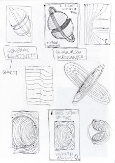
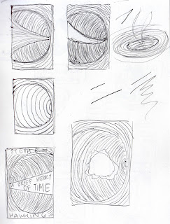
I enjoyed mocking up the Stephen Hawking book cover, playing around with shapes, dissections, simplification, trying to achieve a diagrammatic image that could be universally appreciated, based on the themes of the book, not directly depicting them. I felt engaged being loose with my sketches trying to create something striking and bold that was informed by the book’s content. Sticking to one aspect, black holes, I was able to be exhaustive in my sketches and focus on creating as many relevant possible variations of one idea; with the book being so ‘deep’ and extensive with information, it helped to focus down. However, I found it difficult to then make the final book cover. I was unsure which medium to use and didn't really experiment with this enough, in the end adopting for a cleaner line with a scanned in lino block. By the end I really neglected it, putting in the groundwork at the beginning with the sketching but then not keeping up the momentum. The layout of my final cover is unimaginative and stiff. The subheadings don't fit in the box well and the overall design looks amateur and rushed. Next time I would spend more time on the final layout, and give myself some distance from it to maintain an objective and informed opinion. 


There were a couple potentially successful concepts in the sketches for the socio-political poster, but none that jumped out at first. For this it was a case of forgetting about it for a while and letting it mull over in my mind until an idea came, that of the ‘Return to Sender’. Going typically figurative and ‘accurate’ at first, the initial sketches for this were very stale. Even though the concept was reasonably strong, the drawings being based on photos of my hand were stiff and uninteresting. I then remembered that it doesn't have to be a realistic hand but can be drawn differently to work in the image, so the hand became creepier and more appropriate. I am pleased with the final, the colour being the only real point of contention, being unsure of how effective it is just having the red background.


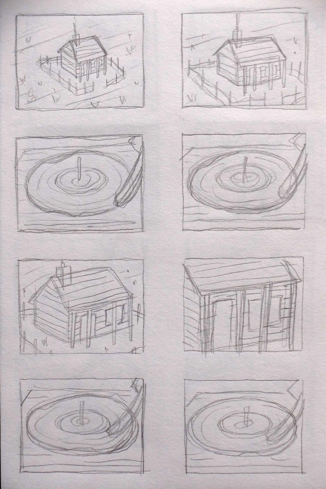
The Hookworms poster was a good lesson in having free-reign over the ideas and images. I found this harder than expected, having little to go off or pull from for ideas. Although I think some of the house roof ideas could have worked, in practice they didn't feel very ‘me’, causing me to go back to sketching and working a bit looser - When an idea isn't working, don't force it…start over. Layout was again a real struggle and took a while to sort out. Even after many versions I am still unsure at the success of the final layout. Something I really wish to work out throughout level 6 more is composition and layout, as I worry it could let me down in future briefs


Monday 5 March 2018

Goals for 504


  • Lesson from 503 - Don't stop developing an idea/concept short of it's possibility, especially when there is more time before the deadline to push it further.
  • Out of comfort zone - Put myself into new situations, meet new people and respond to my experiences visually. Push idea of reportage illustration.
  • Accomplish by May - Better understanding of reportage illustration and where my work fits within that field. Learn more about the possibilities and opportunities with reportage work.
In 504 I want to continue to push my work in the direction of reportage and documentary illustration, learning about what it takes to carry out an effective reportage project and how to turn the collected materials into a coherent body of final work - taking the material I collect from locations and site visits and collating/developing them successfully. I am going to continue to explore what my practice and process is, and how it can stand apart from other contemporary illustration work. I want a better understanding of what value my work can offer and what it can communicate to an audience that is unique and different from the work of others. Printmaking abilities will be further developed and explored, as well as the presentation of the work in a suitable format e.g. a book. I hope that I can keep the dialogue between research and production continuous, letting one aid the other to ensure the work I produce is informed and justified. In doing this, I am hoping the work will more effectively communicate its’ message and purpose to an audience and so ensure the success of my project. 

Thursday 11 January 2018

Reflective Report - Moving Pictures

First idea too complicated and would be difficult to animate. Was going to have camera zooming in through house window, through house and out through back window to reveal motel. Same camera movement continues but through motel window to show dead tree with Cormac’s name spelt out in the tree branches. Would have needed to patch up/reprint house and motel prints to fit the dimension requirements of the animation and to print the assets to make up the inside of house and motel. Seemed to ambitious and unnecessarily complicated for the time and skills available. 

Struggled thinking up more ideas as it is not my usual way of working. Translating flat imagery and illustration work into moving images proved very difficult. It is not just about making illustrations move but making an effective and relevant animation, no matter how simple. 

Had idea of panning camera across the landscape instead, by stitching together my prints digitally and panning in after effects. Joining the prints was near impossible to do seamlessly, with the noise of the analogue printing outcomes and the different sizes of the elements of each print that were supposed to become one, for example the bushes. Decided that redrawing and cutting a new print would be the solution, just on a smaller, simplified scale. This way I can ensure dimensions and space is adequate for panning movement.

Narratively originally wanted to include a gunshot sound in synch with a flash in the window of the house to depict a scene in one of McCarthy’s books before the start of the pan. However this was proving difficult to achieve effectively with difficulties in after effects and knowledge of the software. In the end it didn’t need it, with the audio sound track fitting perfectly with the pan allowing no space for a gunshot to start. The moon’s movement shows a passing of time as well as emphasising the sinister atmosphere, with the colour red. 


Final outcome may be too simple or unimaginative. It was very quick and easy to execute and it has ended up not telling much of a narrative, but more of a feeling. If the brief was just to make out prints move then it achieves that, but for me I would have been happier if it had more substance and energy to it. 
Cormac McCarthy Sting from EhrenBarnard on Vimeo.

Tuesday 9 January 2018

Reflective Report - Printed Pictures

Started by considering what elements of McCarthy’s work are important and interesting, looking for motifs and recurring imagery. Wanted each print to be coherent and link with the others, whether that be with their subject matter or what they represented. Wanted images to have deeper layer and story to them.

Place is an important aspect of McCarthy’s writing. He often describes the settings or landscapes featured in poetic detail. Coupling this with the recurring theme of death, I wanted to depict 5 settings where deaths had occurred in his stories, without showing the actual occurrence. Wasn’t really leading anywhere and struggled depicting the scenes as described in his writing and conveying what his words conjured up in my imagination. Although, I was particularly drawn to how unassuming the images looked despite the dark history they had.

Nature is another aspect McCarthy describes extensively. 5 illustrations of trees I believed could tell a story, each tree representing a different place or situation, with one dead and burnt to again show the theme. This became quickly uninteresting and too easy; I have done lots of work  about trees in the past and this would not have challenged me.

Kept wrestling with place and landscapes, simplifying, making symmetrical, creating shapes and depth and texture in my roughs. Throughout my research I was continually drawn to the print work of Mexican artist Leopoldo Mendez, often showing village people and protesters interacting with authoritarian figures, and the political unrest in Mexico. The way he uses lino and mark making to portray light and emotion and energy is awe-inspiring and he was a strong reference for me. I thought that the use of Lino really complimented the dark, often unsettling imagery. Although my tests with screen print worked, it lacked this macabre feeling, and where the mono print work does achieve this, the process of cutting and working with Lino had me hooked. Figures became of interest and after stumbling across a photograph of some Mexican skull masks I felt like they fit aptly with the themes of the work. At the same time I came back to the place idea, specifically the house and then to a motel based on ‘no country for old men’, the tree fitting nicely in the middle and two skull figures on either side; and so my final roughs came as an amalgamation of all the separate ideas and roughs that came before. I love the idea of the whole set working together as a whole, the composition of each complimenting them all. The moon, as with Idea Pictures’ stands as the consistent death theme and again allows them to work as a coherent series. 

Friday 5 January 2018

Study Task 5 - Sound Storyboard


Fathom by Murmurous 

  • eerie, dark ambient music, unsettling atmosphere 
  • wide establishing shot. moody sky and dark tone, feels empty and expansive to set uneasy atmosphere
  • rear of horse becomes visible on right side of frame slowly walking and house slowly appears in background
  • see parts of rider, hand and eyes looking skeptical, enigmatic 
  • Rider arrives, dismounts and is seen as silhouette in the doorframe of house, unknown what is inside to audience 


Devil in The Lion's Den - Crying Sam Collins

  • establishing shot of house, small and distant, on a 45 degree angle
  • camera slowly moves forward toward house from above at said angle, blues record playing muffled from inside house becoming gradually louder
  • cuts to close up of record, warped and scratched spinning on a player, music is loud and close
  • cuts back to house, again camera getting closer, music louder
  • back to record, needle further into record
  • back to house, focussing in on the front window until audience can see in dusty and cracked window to see a blood covered messy bed
  • finally see the record as needle makes it into centre, record keep spinning and only the crackle of it can be heard


Study Task 6 - Presentation

Pat Perry 


  • signed edition of 250
  • archival pigment print 
  • one colour/tone 
  • 330gsm fine art paper
  • shipped rolled
  • unframed 

  • edition of 350 
  • two colours?
  • giclee print
  • heavy weight acid free matte stock
  • unframed
Allie Webb 


  • edition of 4
  • hand pressed lino print, Graphic Chemical & Ink Co water based ink
  • one colour
  • stonehenge paper
  • from exhibition 'After Dark'
  • framed
  • $590 

  • edition of 6
  • hand pressed lino print, Graphic Chemical & Ink Co water based ink
  • stonehenge paper
  • framed
  • from exhibition 'After Dark'
  • one colour
  • $800


Thursday 4 January 2018

Study Task 5 - Sound Study

Texture - Roman Alaivi

texture // A digital bolex test from Roman Alaivi | Tests on Vimeo.
  • camera test, no real narrative or structure, yet tells a story of a forgotten place and a time gone by
  • Natural sounds, most likely recorded on site of the filming, relevant to location and feeling
  • Unsettling/eerie feel created by sound and visual not synching, sound one long piece whereas visuals change throughout, creates uneasy 'silence' of the subject matter in each shot, elevated by nature of visuals
  • Familiar sounds for an audience yet quite intense and gains in intensity throughout 
TINCUP Whiskey - We Stayed 


TINCUP. WE STAYED. from Andre Stringer on Vimeo.

  • Natural wind sounds establish visuals, layered with guitar feedback, notes and strings. Dark and eerie, creates ominous atmosphere. Low notes create sombre tone, higher notes build story. Picks up at end into glimpse of an actual song, to conclude visuals to a point 
  • Sounds from visuals, such as footsteps, rain, movement etc, immerses viewer in action
  • Voice over describes context and narrates, low gruffly to match the tone of voice of the video as well as the company