Wednesday 30 November 2016

Vis Language - Collage

Collage is a challenge. It's exciting, aesthetically appealing, and freeing, but also really really difficult and restricting and limiting, at times. I think it is just from being new to the medium having only dabbled briefly in the past, but I found myself not quite knowing how to 'make' collages. And one of the beauties of the process is that not knowing, is that mystery and the diving into it anyway and experimenting until something works, but that scared me at first, as a new feeling I suppose.

Not quite knowing the 'process' to collage, I just started cutting out images that I liked or that I thought would work together. At first I think I was being too obvious, trying to find bodies to put heads on, and people that would fit perfectly together in an interaction, but this was stifling and didn't really lead anywhere. It wasn't until I let go and just arranged random elements together that I came up with my first creation, this funky looking bald fella with jazzy pants, pointed shoes and clouds for arms:


Is it a 'good' collage? I really don't know, or don't think so.
Do I like it? Probably not.
But I do believe it is interesting and engaging and almost funny? I think as an example of letting go and just creating something without the fear of failure it is a testament to perseverance and the random, unknown nature of collage, and once I had created this, got over the blank page, then I felt more excited to carry on and make more discoveries.


These two are my favourite. Fair enough they are simple in their nature, but I feel like they tell more of a story and develop the idea of character more than the first. Maybe because they are more figurative and less 'silly' means I like them more...but they are hardly serious. I just feel like as images they are much more successful, combining elements of photography and pattern and shape to recreate areas of human forms and clothing which changes the personality of the figure.


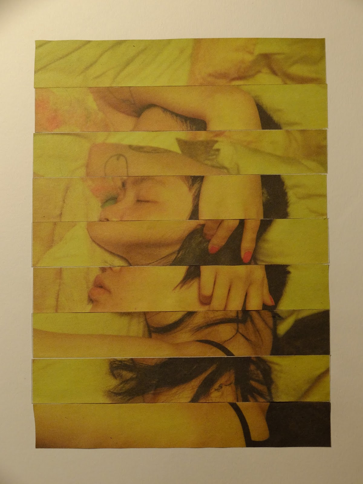
I am also really quite drawn to this last collage I made, from cutting up one image in equal horizontal pieces and rearranging them, bringing each row down underneath the one it should be on top of. I love this idea of rearranging photographs to create somewhat abstract and interesting new images, that in some places accidentally line up again to create other forms. This is the kind of thing I have created in the past and hope to push this further, inspired by the work of Anthony Gerace, who commonly uses grids in his collage work, and the rearranging of portraits to hide areas and create narratives within one image. 

Tuesday 29 November 2016

Visual Narratives - Visual Journalist

My initial thoughts on this brief were 'this is perfect'. I love this kind of brief; broad, engaging, interesting and research driven. I love the idea of getting a subject and immersing in it, researching it and going out into the world and responding and collecting and documenting and generating stories. Journalism is something I have always been interested in and keen to develop my abilities and experience in and I am very excited for this opportunity to do so.

My 3 words:

  • Evolution
  • Folklore
  • Consumption 
I thought they all have possibility but being interested in environmental issues, especially as of late, I chose consumption in the hope of pursuing an interesting and important subject. 

Consumption is a very broad term. It takes many forms throughout our day to day lives, from the food we eat, to the products we buy and the media we consume, all of which could produce interesting material for this project. I decided to focus on the consumption of energy and resources in the supply of our over consumption of commodities, such as electricity. Although despite this, I am still open to other areas of consumption and topics within this subject should they arise in my research process to further pursue.

Thinking of a field trip destination, coal mines came to mind and also Drax power station. With the main aim of making a journey without consuming any resources, I settled on cycling to Drax to check it out. I have researched more about the plant and they do seem to make an effort to be environmentally conscious and reduce their impact as best possible, however they are still creating and investing in a negative impact on the earth.

My plan is to make the journey with a consideration for the difference between such a means of travel versus travel by means which consume resources. I plan on recording every electricity pylon i pass, through photographs and drawings. I want to also record every train that enters and exits the station for the duration of time that I spend there as that is the way coal and fuel are transported to it. I would love to talk to residences or locals around Drax, to find out their views on the station and maybe the close by coal mines too, as well as their overall opinions on the consumption of resources and energy and fossil fuels on their doorsteps. I hope to bring back ephemera relating to the plant, but have yet to figure out what form that could take. 

Thursday 24 November 2016

Visual Narratives - Maps Development

As a group we collated our separate ideas and sketchbook work, as an attempt to bring together all of our favourite outcomes created on our incredible journey. We all liked the idea of trying to represent the physical space of the market as well as the experiences and things we saw within them. Some of the ideas we brainstormed wouldn't have worked, such as trying to draw a birds eye view of the markets from the inside, however reference material for this would have been difficult.

I really liked the idea of using a floor plan for the markets for the background base layer, with all the stalls and walkways made up of lines and shapes. However we instead found a map with an illustration of the markets on, also made of regimented and diagrammatic lines but more as an actual drawing of the exterior of the markets. Although it is a nice image and does make up an appealing and attractive layer, I think it could prove too busy and complex to be printed over with other layers.


This is the base layer. I was really interested in playing around with pattern and texture when layered on the screens, so using the china marker I filled in the areas of streets and other buildings with pattern.


The left is the drawings I have recreated from my sketchbooks ready to go on the screen. The right is a tessellation of all our experiences and sketches from our time in the markets.

I am very interested in the presentation of a relationship between a place and the experiences within it, layered up together. It creates an abstract but engaging connection between the two, where it is not immediately clear what that is, especially when the experiences we chose to depict are so random and jumbled. However we believe that this represents a very correct view of the markets, which are very mixed and overwhelming and eclectic like our top layer.

Wednesday 23 November 2016

David Lemm - Maps and Diagrams

Lemm's work is very intriguing, not only for its visual aesthetic but also the substance and inspiration behind it. He creates very clean, seemingly random yet almost regimented and clearly purposeful compositions of shapes, lines and symbols, responding to places or experiences or journeys in a very abstract way. Using a combination of collage and different print making techniques, numbers and dials and lines sit on top of areas of very tactile, analogue-looking textures, neighbouring symbols and motifs similar to those found on actual maps. Although at first these elements appear to have just been thrown randomly together on a page, I believe based on his inspirations and meanings behind each piece that the way the pages are laid out is important, perhaps relating to the references and subjects he is depicting. The resulting images are very abstract and ambiguous, at times a bit confusing but engaging and very intriguing; you end up wondering what is actually being portrayed within the marks and shapes, and reading about his ideas you start to piece together the content of what he expresses.
David Lemm seems very drawn to environments and landscapes, the way we interact and respond to them, and our relationship to our surroundings. He often 'maps' out places and experiences with his motifs and diagrams, and the way he does this is very interesting. The definition of these maps is a loose one, where it seems as though they are less focussed on where things are in relation to each other (like a traditional map) but they act more as a representation of what makes up a place, a collection of what elements build it up and how they can be visualised. This way of mapping reminds me of the sound maps we did at the start of the week; the experience is built up abstractly as a series of marks and lines and shapes, and is less about representing a physical object in a drawing but more about visualising a feeling or an emotion or a sense of something. They put no importance on accurate depictions and all importance on capturing visually, sometimes subjects that are not even physical at all, like experience.


These responses to landscapes and views are probably the most obvious depictions of physical forms, but created to feel more diagrammatic and abstract than simply drawing a mountain. Shape holds precedence, embellished with texture and pattern to create depth and layout, distinction between different elements, as well as physical textures and surfaces. The use of one colour perfectly compliments these textures and shapes, creating a contrast between the somewhat harsh forms of the rocks and bold mountain shapes.


I really love this map on the left. Aesthetically I find it very appealing and engaging, I think for it's systematic layout and border; the lines are regimented and contained within the box, they are free within it's space but still kept uniformed and controlled. This nicely juxtaposes the lighter map diagram in the background, the free and flowing forms of nature.


Monday 21 November 2016

Visual Narratives - Incredible Journey

I thoroughly enjoyed our incredible journey as the start to our next project, to create a map in a week. Wandering around, being curious, documenting, listening, observing, capturing; it's something that I previously really find joy in, but haven't really been investing in enough recently.

Here are a few of my favourite pages:


I found myself very drawn to:
  • People; characters, old people, bald people, people wearing hats, glasses, with collared clothing, interesting people, different people. 
  • Collections of objects; cartons of milk, stacked cans, tubs, containers, watches. I became very transfixed on this idea of organisation and layout in shops and on market stalls.
  • Scenes/architecture; interesting lines, angles, scenes of mundanity, scenes featuring certain objects.

I think being in a group was slightly hard in this exercise as you have other people's needs and interests and approaches to take into account. This was interesting seeing how other people respond to the environment around us and what things they were drawn to. BUT it did make it difficult to focus entirely on what I was seeing and experiencing and wanting to document.

For this reason I am going to adopt this new found curiosity gained from today's session and spend as much of every day as I can just watching and looking and observing. I am going to try and make a habit of just going out and documenting more and just drawing more of what is around me on a daily basis. Maybe even focussing on one category of 'thing' to document at a time, and creating series' from there.

Monday 14 November 2016

Vis Language - ShapeShapeShape

Shape is something I have somewhat overlooked and pushed aside in my illustration work. I feel like I rarely consider how my images could incorporate or be built up using shape instead of just line, and that is a massive part of image making I have yet to invest in.

As a result this session was very interesting and eye opening and fun, to do something different and approach my work in a new way.


Representing fruit using just shape seems like a simple, basic exercise, however to execute in an imaginative and exciting way proved really difficult. At first I picked a banana to depict, however because it is such an obvious and distinctive shape, thinking up inventive ways to present it was a challenge, however this forces you to think differently and break down something you perceive as very mundane and obvious into individual elements and pair it right down.

My favourite response was the pineapple. Choosing to just create the diamond shape to build up the main form of the fruit created quite a nice pattern, which is a lot more eye catching than the rather boring banana depictions. I like their wobbly, misaligned quality too; it has more character than any other my other outcomes.


Here is the other studio task, combining shape and texture into a self-portrait. It was a fun challenge to try and distill a face into it's most basic forms yet still keep it interesting and relatively figurative and clear. Also trying to imbue character and personality and expression whilst still simplifying into basic shapes was a question of what makes an expression communicate what it does. 
I also particularly enjoyed working with texture and the task of trying to create contrast and variety with it, for example finding 3 different ways to depict hair in order to show the different features of my face. 


Friday 11 November 2016

Visual Skills 403 - End of Module Evaluation

I am pleased with how this module has gone, but feel like it has only just scratched the surface of what visual skills is and can be for me. I started knowing barely anything about how to respond to briefs similar to industry, how to generate ideas and tie in concepts with my work in response to such briefs. I now feel I have a better understanding of how to go about idea generation and in knowing which work responds to certain briefs more effectively than others. I have more confidence in attempting to answer briefs and solve the problems they set, even if I know that I have a very long way to go and so much improvement to make before I am totally happy with my responses.
I would say that the majority of my learning was about the substance behind my work, rather than new skills or processes. However, I did create a digital piece I was pleased with, which I hadn’t previously seemed to manage. Apart from that I feel like I stuck very much to the skills and approaches to image making I already knew, which is something I want to work on more in the coming modules, to push the way I create and learn new processes and techniques to create better images. I did learn a lot about the context of my work and how that impacts the ideas and substance to it. I was able to reflect more on how to generate ideas and to then translate them into a finished piece, through roughs and experiments and sketches. I very much feel like this is just the start of this process though, this module has opened the door and I am only just starting to step my foot through it.
I was mostly happy with my outcomes for the typology poster and my book cover. Both of these projects had a period of getting stuck and not liking what I was creating, but through feedback and perseverance I feel like I created successful outcomes for both, pushing through the walls to create something I was retrospectively happy with. I think both of these were very valuable lessons firstly in not giving up on work and to always ask for a second opinion and not getting caught up in my work on my own. I struggled with the editorial pieces, knowing how to respond to an article with a deep enough concept in an image that is thought provoking. The poster and book jacket I feel were looser briefs and allowed less complex ideas to be executed effectively.
I wish I had experimented more with media and process, being more free with image making and idea generation. I want to get rid of censoring ideas while creating, and allow concepts and inspiration to flow with no restrictions, being risky and imaginative. One problem I faced was not having enough confidence in my work and letting that block my creation. I was getting stuck with creating and not feeling happy or excited in what I was making. Doing stream of conscious writing daily helped incredibly though, and just by getting words down without thought or constraint was very freeing. I want to carry on this approach but in image and idea generation too.

In future project I will try and find a healthy balance between self-reflection and letting go of restrictions. To be able to freely create exciting images with thought out and considered ideas and concepts, but still with a final element of quality control and having the knowledge as to how successful certain outcomes are. I really want to carry on this exploration of the relationship between idea and image, expanding my knowledge and ability to unite them in my work.

Final Book Cover


Here is my final book cover.

I am quite pleased with the outcome, after being very unsure of whether anything I could produce on photoshop could turn out any good or whether I could actually succeed with producing this cover digitally. The way the watercolour of the fish creates a shine when the brightness is decreased on photoshop, creating a subtle illusion of light shining on water. This also creates a nice depth, the darker fish falling back into the water further in the background and really making the closer fish stand out. This alteration of brightness also changed the colours for the better, muting them to more subtle, earthy tones. I think this allows them to incorporate nicely with the background, whereas before they were way top harsh and 'flat'; the contrast between the two was too high making the overall image unnatural and look fake.

The subtle background also works, the fading from pure black to more textured grey tones again creating the illusion of water. Also, scanning in watercolour paper, inverting the colours and layering on top of my ink wash made an effective shimmer to the wash.

I feel like the risk in layout on the front payed off but I feel like the fish could have been better executed. On it's own it looks a bit flat and separate from the background, whereas on the back cover they have each other for context and to look part more of a whole.

Thursday 10 November 2016

Keith Negley - Digital Genius!

...and nothing short of, in my opinion. 

I'm pretty sure these pieces pulled off his website are all digitally completed (as by the looks of it they start out as analogue components, such as brush strokes, textures and marks).


Negley layers marks and details in such a wonderful way, creating an overall very hand-made and tangle quality to his pieces. You can almost feel the layers of ink and texture just by looking at the images, the resulting outcomes complex yet as equally simple, delicate and smooth. His characters are basic in form, but energetic and further brought to life with this exquisite build up of marks. 

The colours used are another stand out feature that really excels his illustrations, pastel reds, blues and oranges, usually limited in tone variety but expertly composed and paired. I adore the way the colours and shade change when layered onto of each other like on the deck to the right. In this way a great variety of tones can be achieved in the use of only a couple of differing colours and it gives a beautiful overall quality to the images, that of a ghostly, soft yet bold effect. 

One of the main appeals to his work is that hand-made feel. You can see the marks and evidence of the human hand, you can see the analogue processes, you can see the character and sheer beauty of physical creation. I think that is really my conclusion on the digital means of creation; it is excellent for compiling images and completing illustrations, pulling together elements to create layouts and final images. Its a tool to take analogue work into a finished form and it is immensely useful for this especially when used correctly. But for now, for me, this is all it is. I don't see myself creating work thats purely digital, seen as the majority of the work I like is for it's analogue and hand-made quality. 

Perseverance Pays! & Digital vs. Analogue - Book Cover Final

Today I learnt the very valuable lesson of perseverance and experimentation, and not giving up when a piece doesn't seem to be falling together as planned. ALSO that creating half decent digital pieces on photoshop isn't always the impossible hell hole it previously seemed to be.

See, I find digital work difficult. I like the look of other's digital work, I appreciate the power of photoshop and the unlimited amazing things you can achieve using it, I accept that there are inevitable benefits of digital over analogue and I admit that when used correctly it can make creative work a whole lot easier/more fulfilling/more exciting etc.

BUT when I come to use it, something happens. Some kind of wall seems to build itself and I get stuck, I don't know what I want to create or how to create it, or whether what I'm making looks good or bad or how to make it better. I sometimes feel like by putting my workflow onto a screen my image making ability shrivels up and my taste hides away with it and I just get stuck.

This issue I face with digital is probably just due to 2 parts inexperience, 2 parts ignorance  and 6 parts prejudice, but today, I pushed through that and created something I am now relatively happy with in the form of my final book cover.

 So, I started with what I know, that is analogue, namely watercolour and brush pen, to create my base images to then work on/into a final cover on photoshop.


As expected I hit the usual block, feeling as if none of the images actually worked together, or looked professional and strongly considering to sack it as a failed idea and resort to what I know, but pushing through that, playing around with the images further, asking friends for advice and just generally not giving up was the BEST thing I could have done, and I have ended up with a cover that I am happy to show people, that I am fairly proud of and happy to look at.

I want to try and continue to push my digital work and persevere past the usual block situation. I see other illustrators who have mastered digital work and it just blows my mind as to how they have managed to layer textures and images so beautifully and skilfully. Scanning in found textures and patterns is something i want to start investing time in also, so having an application for these and a confidence in how to use them effectively will be useful.


Wednesday 9 November 2016

Risky Layout? - Feral Book Cover

So I tried to rework the composition and layout of my fish book cover in order to make the fish featured on the front look dead, which wasn't coming across on my original rough. After some thinking I came up with the idea to just feature one dead fish on the front, and leave a big blank space in between said fish, which has floated to the top of the page, and the title/author's name at the bottom.

I feel this more effectively portrays my concept of the fish being dead, as well as tapping into a part of the actual book where the numbers of fish are falling. It also creates a greater contrast between the rewilding happening on the back cover, which is full of alive, swimming fish.


I think as a layout, this rough is quite risky. Leaving such an empty space and being confident (who am I kidding?) in just having one stand alone drawing accompanied with a title is a bold move. But then I don't really know what constitutes a 'good' layout, or whether it is 'right' or if there's such a thing in the first place. I like it, anyway.

Tuesday 8 November 2016

Judge a Book - Roughs Feedback Reflection

Book: Feral by George Monbiot

Central themes/motifs/feelings communicated in roughs:

  • Relationship between nature and human's industrial & environmentally-damaging lives,
  • Both sides having ability to take over and overcome the other, there's a conflict and subtle tension between the two,
  • concept that nature can flourish when humans are taken out of picture (when the book is closed, the front and back covers are separate)
Main feedback points from crit:
  • Work on fish idea, further link front and back covers, prompting viewer to turn over book to see the back as well,
  • reconsider perspective and view point of dead fish on front cover to convey concept better,
  • revise type layout, hierarchy of importance within typography.
Initial feelings/responses in relation to feedback:
  • Mostly positive and interesting, hearing other's interpretations of work,
  • helpful hearing small ideas and techniques to further push and improve work I hadn't previously considered or thought of,
  • Agreed with most of everything that was said, taken away steps to push work in a more effective direction,
  • not altered direction entirely, just pointers and tips to rework into existing roughs to improve.
Responses to feedback:
Materials/Media/Process - 
  • Experiment with colouring of fish to portray dead vs. alive concept,
  • try collaging fish images onto an analogue background, compare that to a digital layering,
  • try digital techniques to create underwater look, using scanned in tissue/watercolour paper.
Composition/layout/typography - 
  • Explore typography, reflect on decisions made, why drawing each letter in a certain way,
  • rework composition of fish rough to ensure an effective flow between dead and alive fish, also trying to fit dead fish idea into the space/composition,
  • work on layout of type and incorporation into image.
Crafting/production - 
  • watercolour with black line work,
  • explore light shafts,
  • digital media, underwater experiments,
  • collaging digitally and analogue.
Additional reflections, aspects that need resolving:
  • pleased with roughs but keen to push further, incorporating layering, multiple techniques, concept execution,
  • difficult to judge ideas as successful or not, knowing which roughs were both aesthetically appealing and conceptually effective enough,
  • layout reworking and media experimentation,
  • exaggeration and viewpoints.
  • favourite brief so far though, as can be more conceptually and visually 'vague' but inventive, without conceptual constraints. Can take one idea from book and depict it, without needing deeper idea behind concept.
ALSO....

Difficult to pick rough to develop...I like them all but after discussing with Jamie he suggested some as too 'editorial' which I kind of understand...but it's an interesting conversation about editorial vs book cover design, which images being more appropriate to one or the other or being more effective in a certain context over another. 


Tuesday 1 November 2016

We Built This City - Dream House

Although this is perhaps not an accurate depiction of what my dream house would be like (because in reality I either want a humble little log cabin, big enough for a bed, a wood burning stove and a desk to draw at, or a mattress in the back of a van), it was a really interesting exercise to put what we had learnt earlier on in the session to use on an actual piece of work.
(Another lovely thing about it was that it felt like the last week of school before christmas when you just do fun activities and forget about real work, and the fact that this was real work and a real actual adult degree...nowt better).


So this was my house...I went for a very layered approach to my architecture, piling roofs on roofs on chimneys on windows. I used this to explore mark making more extensively though, giving me numerous different surfaces and areas to work into, attempting to make each one unique and different from the next. 

As a final piece, this variety gives a really nice depth and feel to the drawing; it makes you want to look closer and pick out the individual areas of marks. Again I come back to this word tactile and tangible; there's a visceral pleasure to looking at (and building up) marks, especially when close together in one image. Probably why I have always fallen back to creating tone and surfaces using detailed, meticulous marks. 


Vis Language - Tone, Mark, Pattern

As a follow on from the line quality session, today's session focussed on mark marking to create tone, surface, texture, depth and quality to drawings. As someone who's work has nearly always previously featured some type of hatching or stipling technique, I really enjoyed getting lost in the meditative process of making repeated marks over and over. Tiring as it is, it's so therapeutic to just get lost in the marks, the constant repetition of muscle movements; as long as restlessness is kept at bay that is!

A Lesson in Contrast, Juxtaposition & Representation

From being unsure last week of how to translate a word into an image, I found today's exercise surprisingly manageable and fun. Creating texture and marks from a word seems to work out easier in my brain than creating a figurative, literal image, and I found the challenge of contrasting the two words in the marks I was making really satisfying.

My Words:

Soft - Hard
Calm - Giddy
Transparent - Solid


I could maybe have played more around with the relationship between the two words on the page, like the circle even digram I made of transparent/solid. I feel like by creating a link or bond between the two could create some really nice compositions, and may say a lot more than the two separate areas of marks. But as a task in experimenting with mark marking, I feel may outcomes work. There's something inherently beautiful and tangible about the marks created, especially on this bottom photo; those collection of tightly drawn squiggles and dots are almost comforting...

I would love to carry on exploring mark making, and really push the different ways I can create marks with a multitude of tools to represent different surfaces and physical forms.