Monday 11 December 2017

Study Task 4 - Animations

The New Yorker X This American Life 


Mirror from NewYorker on Vimeo.


  • Starts as 2D illustration then becomes 3D and animated, really brings flat image to life
  • Dynamic pans and movement of camera to give different perspectives, breaks fourth wall
  • mixtures of animating techniques and styles, becomes flat line and shapes after appearing more 'real' and close to life
  • Narrative voice over, some words becoming visual, visuals follow narrative
  • Changing scenes and time scale and compositions, great variety


Adam Osgood


Spooktacular: An Animated Alphabet from Adam Osgood on Vimeo.


  • Same composition throughout, going through alphabet
  • movement on each is simple and relevant to each character, bringing illustrations to life and giving them personality beyond the 2D
  • quite fast paced, matches background sounds of heartbeat and eerie guitar score
  • Tells story of type and character design

The Atlantic 

The Making of a Black President from The Atlantic on Vimeo.


  • Simple illustrations with little movement in each aside from entering and exiting
  • Main body of animation consists of traditions and moving of assets around screen, very 2D and simple
  • Type used to aid narration in parts, brings sound to life in visual form
  • Coloured backgrounds used for traditions and to change scenes
  • very simple and limited colour palette 

Thursday 30 November 2017

Study Task 3 - Print Practitioners


Mike Schultz 


  • Simplicity in depicting forms, not too much information
  • Combination of cutting key line and tone/texture
  • Mix of techniques, woodcuts, monotypes, lino cuts etc.


Allie Webb


  • Lino cuts
  • Busy scenes, complicated compositions, layers in depth
  • interesting/flat perspectives
  • mixture of textures and mark making
  • different portrayals of light
  • dynamic depictions of forms 


Kathleen Neeley 


  • Lino prints
  • Medieval feel to images, how figures are cut
  • Line important to create tone and textures
  • figures play main role, quite simple backgrounds used
  • intricate patterns used to create tone and light


Tuesday 17 October 2017

Reflective report - Idea Pictures

Started off trying to create perhaps more typical editorial concepts with visual metaphors and juxtaposing elements combined together to describe McCarthy’s work. Firstly focussing on the motif of horses, combined with imagery relating to the themes and places written about, such as religion, life & death and barren expanses of American landscape. Really drawn to juxtapositions and contrast, and it was a good challenge to link two ideas into one coherent image. Using motifs and visuals that at first look meaningless but have deeper meanings can be very effective for editorial work, especially if those meanings become clear in the copy paired with them. However forcing this approach to editorial can create obvious and boring work, and although I want my work to have meaning, I don't want it to look predictable. Letting anything come out during the ideas stage is valuable, no matter how bad or good, and then analysing afterwards. These first few ideas were not so strong or exciting so I dropped them, even if they had some potential. Symbolism is another really fascinating and important part of my practice. I love imbuing meaning in a subtle way through the imagery that I am working with, avoiding force feeding a viewer what is being said or communicated. Mexico and American’s histories and traditions is full of symbolism also so it was appropriate to pursue this direction. McCarthy’s work deals with topics of life and death paired with other ideas, so that was something I wanted to include and communicate with my pieces. There is a Mexican card game called Loteria which is a game of chance which I feel evokes McCarthy’s work well, and my work was becoming more reflective of tarot card’s naturally with ideas that were coming up. Using a few simple symbols I communicated the themes explored by McCarthy as well as one of the anecdotal stories in one of his books; the sun represents life, the moon represents death, the horse shoe for chance and the church to explain the story of God punishing human’s bad will. Lino cuts were immensely rewarding, wrestling with the process is valuable and the traditional nature and tone of voice of analogue printing pairs beautifully with McCarthy’s work; dark, unforgiving, ceremonial and laced with tradition and history. 


Thursday 5 October 2017

Study Task 2 - Editorial Illustrators

DAVID PLUNKERT


  • 'Flat' visual perspectives
  • Minimal colours for effect
  • More ambiguous than obvious visual metaphors
  • Probably digital, subtle noise and textures, strong shapes

DAVID FOLDVARI


  • Simple ideas/images, powerful messages
  • accented red colour 
  • black and white contrast, dark 
  • texture
  • No really complicated metaphors, straight forward imagery 


Tuesday 3 October 2017

Study Task 1 - About the Author Zine

Enjoyable, quick project to start responding more to author's work. Wanted to approach it differently to summer work, make it visually different, and not spend too much time. Picked quotes at random from books and visualised in roughly 5 strokes/lines. Simplification and reduction was key and challenging but restriction brought new imagery and thinking. Communicate with less. 


Sunday 24 September 2017

5 Motifs - Nature

Nature is an important topic in Cormac's work and is often explored in its relationship to humans, the conflicts and the bonds that are formed between the two. 

The wolf in The Crossing is a perfect example of this, staying wild yet forming a degree of trust with a boy who is set on returning it to the mountains. Although it is never really tamed, it builds a relationship that seems to go against its nature and instinct. 


Just like the horses and greyhounds, this was a task of practicing form and movement and anatomy. Somewhat unspecific to the writing itself, it is still an important process to go through and hopefully will aid me in making some more specific and writing influenced work on the same subject. 


However I really really love these four images. They are drawings of wolf fights and hunts, drawn from videos found online. With the nature of video it was all about capturing gesture and subconsciously letting my hand get down what my eye was seeing as it moves and changes ( apart from the last one which is of a still taken from a video, yet drawn in a similar manner). I think they really portray the energy and movement and violence of the situations, and can still be pieced together and seen for what they are.

I am really intrigued to explore more abstract images, going back to the experience of reading. There is something very unpredictable and freeing about this way of making work and is very enjoyable. 

5 Motifs - American Motels


Motels are often used by McCarthy's characters and seem to almost provide a interim time for their adventures and lives. They are very typically American and portray the nomadic nature of a lot of the people in his books.

I started trying to draw without reference to no avail so looked at a few photos. The graphite drawings are okay at best but were not punchy enough in there contrasts or forms.


Brush and ink again proved the best and I was extremely happy with the one above. I think the detail in the sky is very atmospheric and the building itself gives off a very ghostly and mysterious feeling. The relatively simple nature of it also aligns with my goal of images derived from memory or a deeper part of the mind. 


Light is also commonly an important feature in his writing, something which I am very keen to explore and perfect and portray effectively. I think these create a sort of uneasiness in a viewer something which is also present in the writing, the situations and the people in them. 

5 Motifs - Death

Death is a very recurrent theme and situation in McCarthy's work. It is often pondered about and discussed by a lot of his characters, and loss is something that is experienced by many of them. He seems to explore the philosophy and purpose of life a lot and so death also.


This is a unique topic that I have drawn so far in this project, with it being more of a concept and a none-physical thing with a specific appearance (although it also does have a appearance and is a physical occurrence just as life is also). 

Trying to use more abstract imagery I was trying to present the idea of an end or a passing away, a cease of existence after a time of movement and life and energy. Brush and paint or ink was a good way to get this as the strokes inevitably come to an end when the brush gets drier. 


These are strange in that they are in no way specific to what I was reading or the author I am exploring, and in that way they are not successful or useful even. They just explore a universal concept and happening, in no particular way or context. 

I think this idea of drawing death would be a lot more useful and constructive if I was to find a way to make it specific to the reading I have done and give it a context within this project, something I have yet to discover. 


5 Motifs - Horses

Horses are another thing McCarthy is clearly knowledgeable on and attached to in some way. They feature often and in most of his works in detail and are characters in the stories in their own right.


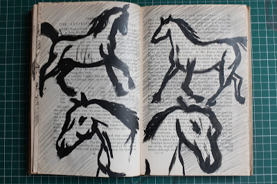
Again similar to the the greyhound work, this way mostly an opportunity to practice drawing horses and perfecting their form and movement. I kept trying to draw them from as many different angles as possible.


I think as usual the brush and ink studies turned out best. They're gestural and loose and full of movement. Tone can be achieved as well as a wide variety of line weight which is ideal for animal studies. 


Simplifying the horses down into their most basic shapes was a fun ad interesting challenge. Movement and form has to be captured with little marks, which makes for cave painting-esque images. Interestingly they can also end up the most engaging of them all. 


With this project I am very interested in trying to portray images as memories or as vague images in one's head, which is the experience of reading a book. I think this almost achieves that by showing a faded or misty view of the animal, as if only slightly recollected or seen through a haze of memory and imagination. I think this idea could be enhanced if this layering was applied to a looser image, one that is less true to life perhaps. 

5 Motifs - Guns


There is not much too say about these. Cormac's work often features often relentless violence and guns play a large role in that, often named specifically. He evidently has a wide knowledge on fire arms and deems it important for the reader to know the specifics of what his characters use. I can see how at times this reflects the character's personality or supports their identity, which could be the reason. 


One thing I can comment on is the way these are drawn; I enjoyed the looser way of observational drawing and the rough background layer of colour. 

5 Quotes - 'He felt something cold & soulless enter him like another being & he imagined that it smiled malignly & he had no reason to believe that it would ever leave'

What a beautiful and dark way to describe the feelings of heart break.


Malignly is such a difficult word to draw and expression to create on a face. Again I had a very strong and vivid image in my head of what I wanted to draw but it took some work to get there. The graphite stick just wasn't really dark enough and although I wanted something ghostly it just didn't have enough strength to it. Also the hearts surrounding the head was a bad move.


These started become more of what i was going for, but there expressions were too exaggerated and cartoon like. I was more wanting something sinister and twisted but still in keeping with 'soulless'. Although the definitely have something too them with a build up of tone and textures and mark making.


Using paint was a definitely leap in the right direction. Being able to properly layer tone and create more ghostly and eerie faces through the use of brush strokes and marks proved very successful. Although these felt still a little too 'defined' for what I was going for, with quite clear and structured features.


These two were the closest to what I was imagining, the right one in particular. I love that it's mouth is not clear yet you can still make out a sinister smile of sorts out of the marks. The head position adds to the dark personality portrayed in the character, and the deep, eye-less eye sockets. I would've maybe preferred some more of the blue-y tones used above but these are definitely a success to me anyway. 


5 Quotes - 'John Grady looked at the little square of light in the door & at the skew of it on the wall above the old man's head where he sat'

I love the way Cormac McCarthy commonly depicts light in interesting ways. It makes for very cinematic reading with atmosphere heavy scenes. 


I really seemed to struggle to depict a patch of light in a shadow with these first attempts. Maybe it was the addition of colour throwing me off? By the looks of the first one I was unaware what a shadow actually looks like, instead drawing what seems to be the window with the light illuminating behind.


Keeping it simply black and white was definitely the best move. I love the stark contrast between the white of the light and the dark shadow, and then the texture of tones on the man's face to break that up and exaggerate it. I was impressed this time that I was able to draw this from my mind and not use any reference to do so. 

I think they tell an interesting story on their own, as it is unclear where the man is or even who is it, he is just a figure in the dark. However the patch of light suggests a room and from that I believe a viewer could assume a cell (which is the case). 


Final unsuccessful experiment with texture. It just does not achieve the same contrast or boldness that the ink studies above do. 


5 Quotes - 'Suddenly 3 greyhounds trotted into the light one behind the other & circled the fire, pale & skeletal shapes with the hide stretched taut over their ribs & their eyes red in the firelight'


Another very visually evocative quote. My responses were mostly just to practice drawing the animals themselves, as I have never really drawn dogs much in the past, and in this way it was a very engaging exercise.


I find it very rewarding drawing new things and trying to capture their essence and form effectively, especially when they have interesting shapes such as these greyhounds. Also exploring new techniques in order to find the best way to portray them is exciting. 


The most effective ones are the brush and ink; looser marks and lines give them more energy and life, creating movement in their shapes. They can also then take on the same dusty quality i have spoke about, making them seem haggard and wild. 


This was my only attempt at portraying the light explained in the quote. My tones are not dark enough on the dog to capture what I was going for, but the intention and potential is there. It gives them a ghostly quality which I think Cormac was going for, and which can be achieved. 

I am definitely going to come back to these different quotes and animals to explore this further, to attempt more intentionally to depict the quote and images in my head when reading them. 

Saturday 23 September 2017

5 Quotes - 'They rode till noon & past noon. There was nothing along the road save the country it traversed & there was nothing in the country at all'.


Attempting to portray the sparsity of the landscape the characters travel through. Abstract yet bold portrayal of the road cutting across a empty body of land. Keeping mark making simple and sparse whilst still creating depth and vastness.  


Left page perhaps too abstract and unclear. Still creating textures with simple mark making but from different perspective so less context with which to work out form, perhaps too little. Other two turned out fairly boring and unimaginative, not much to interest a viewer, no focal point.


I like the disjointed feel to this one, although it does not really show the emptiness that the landscape is said to inherit. theres definitely potential with ripped up textures and layers to show depth, though. 


The most successful and my favourite outcome is the right one. It does not so obviously 'empty' as a landscape but it is still barren and has a really captivating 'dusty' texture to it. The paynes grey creates an excellent second tone and background layer. It exists as harsh and desolate as the landscape I imagine the characters traversing.