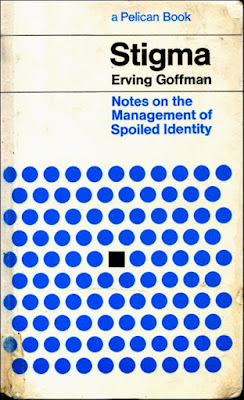
If we are talking about shape and the use of very limited colours, 2 in this case excluding a black outline, this jumped out at me. The way that the designer has inferred the concept of 'judgment' in such a simple yet elegant way, the use of the vague eye shape and the harmony and relationship between the teal and blue colours, and how that relationship changes when influenced by the 'eye'. It is just incredibly clever and inspiring to see such simple yet basically genius design. There is zero unnecessary information present, all that is needed is there and nothing else. And also even what is included is paired down to its bare minimum; the viewer can see that the circle is an eye, yet anatomically is may not be perfectly correct or detailed in it's style.
Again, 2 colours, 2 wonderfully simple shapes, 1 perfectly communicated concept. These are visual ideas, they are visual representations of intelligent concepts yet they also function as effective and aesthetically appealing pieces of creative work.
JUST BEAUTIFUL. And so so clever and thought-provoking and tangible.


No comments:
Post a Comment