Tuesday 28 March 2017

Visual Communication - End of Module Evaluation

Despite, as always, experiencing periods of struggle and doubt, this module has probably been one of my favourite in regard to my responses and the work I have produced throughout. I feel like I started to push myself with my GIFs, experimenting with a long and time consuming process, and then really picked up the momentum with the sticker brief. I tried some new approaches with the simplification and shape work, and was then able to carry this development on for the Persons of Note to finish off with a very different outcome to anything I have previously made. I have really enjoyed the individual briefs and felt I have had enough space within them to take risks and branch out to new things. They have felt somewhat more informal almost than any other briefs we have previously been set, and that has been really pleasant to have that opportunity for more self directed and initiated work. It felt as if I could explore more of my interests and be looser with my responses and outcomes as a result, instead of feeling like I have to adhere to a certain set formula of image making or work process. 
I am really pleased with the work where I have surprised myself with my outcomes after employing previously unexplored processes and media, such as mono printing. Wrestling with new processes is always fun especially when they are so hands on and engaging; getting it wrong, trial and error, making mistakes and ruining prints is all part of the journey to arriving at an outcome that I can be satisfied with. Naturally I could have pushed this further and maybe been more intentional and exhaustive, perhaps in regard to my roughing, but the techniques and approaches I have engaged in have been immensely rewarding and exciting nonetheless. I feel like with new processes the actual process becomes maybe more important than the images, as you are learning and discovering what works and what doesn’t, however I do believe I was very conscious of the work I was producing and was very intentional with it, especially in my Persons of Note responses. 
In terms of visual communication, I have found it very interesting to be more ambiguous and evocative with my work. Trying to weave a meaning and story and personality into abstract work is challenging but exciting and fun to struggle with. I have a lot more to develop with this, but I have made a definite start.
I definitely could have researched more contextually and looked to other practitioners more during this module, but I also really like the fact that I have produced this work out of my reactions to the problems set, uninfluenced or untainted by the practices of others. Obviously other’s practices are immensely important and valuable to research and learn from, but in this work I have not felt the need to invest much into them, for better or for worse. 

I want to continue pushing new approaches to working and making images. I feel like I would also love to start incorporating this with my older working processes too, such as the woodcut I printed for Persons of Note and perhaps more figurative work. The combination between shape, texture and more refined image making really appeals to me, especially with narratives, meanings and intentions worked into them.

Persons of Note - Where is the end? When is Something Finished?

I was talking to Matt yesterday about my final poster, or what I thought was my final poster, and he suggested adding some extra textures digitally, some more marks and nuances to the print to finish it off. With having to hand in my poster at the digital print drop off not long after, I didn't have enough time to make such changes before I got it printed.

But it did spark up a few questions in my mind about what is 'finished'? When should you just leave a piece of work alone and when should you carry on exploring, adding and altering the final result?

My Grandpa always used to tell me regarding watercolours, 'if you don't know whether it is finished, it probably is', preventing overworking and muddying a painting which is all too easy with watercolour. And over working any other piece of work is very easy too, there is always the risk of overcrowding compositions, overcomplicating colours and marks, and pushing images too far past their finished sweet spot. There is also a challenge of going back to a piece you consider finished and working into it more; there is something in me that wants to leave it alone and let it be, and any mistakes or improvements should be learnt from and carried onto the next piece of work, the previous existing as a learning curve and an example of a lesson yet to be learnt. 

I believed I was being bold and confident with my final poster, leaving it as just a collection of shapes mono printed into a simple composition. All my work previous has tended to involve intricate processes and elements, and I really wanted this body of work to be a step away from that. And for that reason I am leaving the poster alone, even if Matt's advise could very well be right. I always really appreciate getting feedback and improvements though and see the immense value they hold in pushing my images further.

Persons of Note - Project/Time Management


Lists, to-dos, daily plans (along with my weekly food plans). These greatly help me get through projects efficiently and successfully. Without them I honestly don't think I would ever make the deadline in time, certainly not with the whole body of work. I am way too forgetful and unorganised to cope without planning and keeping track of what I have done and what needs to get done.

I really like to be able to look at a page in my diary and know exactly what I should get finished that day and it always really helps with stress too to know that I can plan the next week and be sure that I will get everything done in time. Another benefit is ensuring a balance between life and work, although this is something which I have yet to find and maintain. If I allot a specific set of tasks to a specific day, I can more or less allow myself to do extra things outside of uni providing I tick off all those tasks in the day, as well as balancing a work load out over a set number of days so I'm not overwhelmed or drowning one day and twiddling my thumbs the next. 

Persons of Note - Final Crit, Success of Communication?


It was really interesting to see how people interpret and read your work blind, when they have nothing else to influence or inform the work other than itself. I guess in a way it is the ultimate test of how well the work communicates the feeling or intention it was supposed to. If it can be successfully read outside of any context then it is perhaps successful.

However, interpretations and readings of work are inherently totally subjective and very easily influenced by other things, especially the context.

From what people have written, it appears that at least something of my intention has been communicated. Especially the top group, with the words I have highlighted (sombre tone, thoughtful, ...the world in shape, process of the mind etc) and with both groups writing 'science', I think it's fair to say that they are in some way effective. I believe that maybe with the added context of Jarry, perhaps his name next to the work, or a little description of pataphysics maybe, would have emphasised this reading and the audience would be then able to make the connection between the man and the portrait; or at least the science and the portrait. 

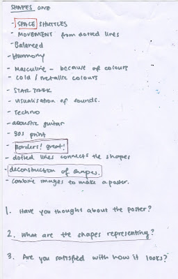
The ambiguity is clear from the question 'what are the shapes representing?', and there's something about that I like. Not only is pataphysics esoteric, but also I don't think the work would be interesting or effective if it perfectly explained the science. Illustration is not meant to spoon feed it's audience, it instead should hint at, evoke, suggest, deconstruct, make sense of etc concepts and ideas and meanings, provoking the audience to then research more after their curiosity has been sparked by the work.

Monday 27 March 2017

Persons of Note - Final Stamps


And finally, my final stamps.

They do actually fit together to make one bigger composition, but blogger is being blogger and not letting me place them next to each other in order, so you'll have to trust me on that one.

Again, I am really happy with how these turned out. I love their ambiguity and the layering of the mono print inks. They are bold in their simplicity and similar to my other outcomes are scientific yet abstract in their visual language. 

Technically, I wish I had used a lighter grey to allow more of the bottom layer to show through, but having messed up a few other runs and not having enough drying time to redo this one, I have to settle for this. I could touch it up in photoshop but I don't think it effects the overall print quality too much. 

I am pleased with them as a series and how they can be pieced together to make one bigger print; I feel this is a nice touch. As a bigger print also I think it is successful and appealing in it's balance and layout of shapes.

They perhaps have less meaning and thought behind them than the poster, but instead exist as an extra, an aesthetically similar product to go with the poster and postcards; they are not the main focus on the body of work.


Persons of Note - Memory Palace by Hari Kunzru, Missed Opportunity

Memory Palace got recommended in my first tutorial for persons of note, and I took it out of the library right away. I did read through it briefly, but at that time I was in the very beginning stages of my responses to this brief, and I feel like I perhaps didn't invest enough time into looking at other work. I was more looking into Jarry's writings and ideas and trying to process them myself in order to make sense of them and give my own interpretation, and in doing so I missed an opportunity to be inspired by some very exciting work.

The actual book didn't really excite me that much, but maybe I just didn't give it enough time. HOWEVER, flicking through again today I discovered the section at the very back, which was Illustrator Robert Hunter's portrayal of the project behind the book, in the form of a wordless graphic novel. And I was instantly intrigued.


I am so inspired by the sequencing and layout of this book. Stories are weaved in interesting ways, using symmetry with the frames and shapes used. The different shaped frames are also used to tell a different part of the story, to have a slightly different angle within the same context. 
The black and white aesthetic is immediately striking, the strong black shapes and forms along with more detailed textured areas. There are also little hints at diagrams and scientific drawings linking different parts together; strong lines and shapes. These are not confined by the frames either, they spill out and morph into other frames and images and timeframes. All are really interesting ways to tell a story without words.

I feel like in this project I could have employed more of a balance and relationship between scientific drawings, shapes and also more figurative images. I could have weaved a story (or at least roughed and tried to) using similar techniques. But then maybe it didn't need anything figurative and my diagrams were enough...

Sunday 26 March 2017

Persons of Note - Final Poster


The final poster.

I love it, I didn't think I would be I do.

Clearly the actual print has flaws, as explained in previous posts due to monoprnting's imperfections, but they add to the overall success, not take away. After all, pataphysics seems to accept flaws and imperfections and nuances. 

The simplicity of the design is something which I am really pleased with myself for having confidence in and sticking with. I could have added type or more elements but I feel that would have simply overcomplicated and spoiled this composition.

I love that at the same time as feeling like a very scientific diagram, it also almost looks like a flag of sorts, or a logo or symbol of a secret group of society. This is not only intriguing and highly appealing to me as it is, but it also does represent pataphysics, which is somewhat exclusive to those who understand it or are fascinated by it; pataphysics is esoteric. 

I ended up creating a border for it in photoshop from one of my scanned postcards to finish it off and also to nod to said postcard. It gives it a context and makes it look like a more considered finished poster. 

If you would have showed me this design at the start of the year and told me I would make this a few months down the line and be really pleased with it, I wouldn't have believed you. And I love that fact.

Persons of Note - Final Postcards

Here is the series of final postcards. Im actually really happy with how these turned out. Obviously they are not perfect but mono printing does not yield perfection and thats its beauty. The unpredicted textures, noise and marks are what make them so appealing and interesting; the prints are as hands on as the process is.


On the top and bottom one it is evident where the paper for my template has broken down after being rolled through so many times, allowing some ink to pass through creating the grain of maroon ink, but I think this really adds to the overall quality to them. There were some that were way too grainy, obstructing the design, but these finals have the right balance

The middle print turned out near perfect. With how I had trimmed the bottom print and with using and A4 plate with an A5 template, it was basically impossible to line up the layers properly, and took guessing to get anywhere close. But miraculously this one just worked out and lines up perfectly.

I ended up printing the bottom one the wrong way around; the circle was supposed to be on the bottom and the square on the top of the print, however I think I prefer it this way around anyway. It was just due to me putting the template the wrong way around, but I think it has more balance compositionally the way it is in this one.

This basically goes to show how unpredictable and exciting analogue printing is. Happy accidents are plentiful and make for a very engaging process which is full of surprises and challenges and tests but it all just makes it all the more rewarding when it actually works out well.

Saturday 25 March 2017

Persons of Note - Mono Printing, Learning, Challenges and Misprints

I learnt a lot about mono printing through this project, its limitations, capabilities, how layering works. It took a LOT of trial and error to get any half decent prints and it admittedly got quite infuriating and tiresome at times, BUT it paid off.

Here are a few misprints when trying to get my final prints.


I discovered a faster way to print my postcards, by using an A4 plate I could fit both designs on one and so print two in one, as long as I was conscious of which was the templates were when over printing the second layer.

The same printing problems were occurring with my posters as with the postcards. No matter what I tried I just couldn't seem to get the finer details, specifically the dotted lines, to print sufficiently. I tried more ink, packing out the press with paper for more pressure, rolling the press twice, yet they still weren't coming out very clear.

One cause was that when inking, I didn't re-ink the roller after it had done a full rotation, so the tops of the plates had less ink and so didn't print as well as further down.


In the end I cut the dotted lines on the stencils bigger and on the poster I sized up my templates from A4 to A3 to allow more space for the ink to come through. Couple this with different blankets on the press and sufficient inking and I started to get some decent prints. 


Tuesday 21 March 2017

Persons of Note - Stamp Tests

I tested out my idea for the stamps using one of the poster mono print tests.


I do actually really like these, however I seem to be unable to tell whether they are actually good or successful or not at all....

I love their simplicity and abstractness. They remind me of book covers that are driven by overlapping shapes, of which Pelican has published quite a number in the past. 

I feel like my final ones will inherently be more effective if I design the print correctly to allow them to still have meaning and a more considered composition. But then if I do run out of time and the deadline approaches without me being able to execute this, at least I know that I can use my poster as a basis for my stamps designs. 

Persons of Note - Plan, Final Ideas & Execution

I have some what of a plan for the rest of this project and the final pieces of work to come from it.

My final poster is going to be a mono print of the analysis of pataphysics diagram, reprinted on Thursday and Friday. I am still debating it's value as a piece of finished work and whether it is good enough or substantial enough for a final. However it is something totally different from any of my previous work and I think it's bold to have those two diagrams overprinted with nothing else; whats more is I don't want to overcomplicate or crowd it for no logical reason. This will be printed A4 and then digitally printed at A2.

My postcards are then also going to be mono prints of the same idea and shape, but of different compositions, showing the relationship between the shapes but in an aesthetically different way. These will be mono printed at A5 and then digitally printed at A6.

My stamps are going to be crops of the same shapes and a similar composition, but I will make a different unique mono print to create these, if time allows. I still need to rough and figure out how this print will look to allow me to effectively crop legible and effective stamps from it. I do also really like the idea of a series of stamps that when viewed collectively make up one bigger design, which I may try and create with these.

Persons of Note - Woodcut, Confession

I have to confess, rather regrettably in fact, that this woodcut is most probably (definitely..) my favourite piece of work that I have created so far on this course. Now, I don't know what that says about me as a practitioner of this discipline or of my knowledge of illustration, but aesthetically at least, I absolutely love it.


Firstly, analogue printmaking; you're already onto a winner in my books. I have kept meaning to exercise my interest in printmaking but just haven't really found a very suitable time or project in which to do it. And I have to admit, this piece does not fit with the work that I am making for this brief and I feel like I had already accepted that by the time I came to start it, but it was so lovely to do still! I really enjoyed investing in the lengthy and time consuming process, fulfilling my need and obsession for such methods which I have neglected mostly throughout this year so far, in favour of looser, quicker techniques. 

And then the print itself, theres just something there that really speaks to me and gets me so excited just looking at it. The portrayal of light using marks and textures, the tangibility of the wood grain and imperfections, the dark and evocative subject matter.

To bring it back to illustration and away from just the mere aesthetics of the thing, I do believe it is a portrait of Jarry of sorts. It portrays his obsessions and his, perhaps sinister, personality and interests. If we are arguing what made Alfred Jarry the man he was, then absinthe and guns unarguably played a very major role. Finish that off with the candle stick, referenced in the works of Jarry as one of Ubu's many absurd sayings and there is a portrait of Jarry in a simple still life. 

Persons of Note - More Mono Prints, Pataphysics


Some more tester prints, this time of the Pataphysics analysis diagram I roughed up in my sketchbook.

In the feedback sessions the colours were discussed and approved of; the combination of grey and a deep maroon burgundy colour is as reflective of the time as you can get whilst still employing colour, seen as the photos from 19th century are all black and white.

They didn't print too great to start with, the fine details of the dotted line not getting picked up enough probably due to the lines being too light in weight.


I actually really love how these have layered up. I think the colours work really beautifully together, the grey allowing the darker maroon to still show through and the forms of the shapes underneath to stay legible and clear.

Again the dotted lines haven't really come out all too well. Another mistake I made was printing the top layer before the bottom layer was totally dry, meaning a double print has been caused by the wet ink getting on my stencil before over printing. The stencil also ended up ripping due to it being on too thin paper, of which are visible in the prints where the ink has made it through the rips.

Overall these were very messy and fair unsuccessful prints. BUT they were a learning curve and a valuable one at that. I know that the designs layer up nicely but the stencils need to be thicker and the top layer can only be printed once the bottom is dry.

I guess the handmade and rough quality to these prints could be reflective of Jarry's wild mind, but I believe that could be pushing it a bit...

Persons of Note - Mono Prints


Here are my first attempts at mono prints that explore pataphysics. They are based off Jarry's quote regarding the shape of a watch, portraying the relationship between a circle and an elliptical shape.

Print wise a lot of them have come out so nice and I am so happy with the textures and noise some of them have picked up. Some of my favourites are where the blue and the red shapes are of different print quality, when one is clear and bold and the other is grainy and textured. This creates a nice contrast between the two and also communicates the difference in the two ideas also. Theres a duality there that is also present between general science and our reality versus pataphysics and Jarry's ideas of reality.

As designs they are perhaps too simple, they are very basic in nature. I do like this however as I feel like they are bold and quite powerful, but I won't be using them in my finals. They were a fun test of the medium nevertheless.

Monday 20 March 2017

Visual Language - End of Module Evaluation

I have really enjoyed this module throughout this year. To have a module dedicated to pure image making and developing a visual language through exploration and learning has been invaluable and highly important for my practice. I feel like throughout it I have tried to push my image making and have explored new processes and approaches to how I create a picture, however I can’t help but feel like I could have pushed further with more imagination and ambition. I am still learning to not revert back to old habits by default in terms of how I make images and instead to consider other options that may better suit my intention, and I see this as on ongoing process. In comparison to how I would previously have made an image, even just a few months ago, I strongly believe I have come a long way. Even if sometimes I do sway towards old methods, there is undoubtably a second thought before doing so and a consideration for other methods first. 

I found it fascinating to break down image making into different components and really evaluate and consider how these are used in the works of others and then in my own work. I believe there is an interesting mix of aesthetic instinct and conscious decision making when it comes to employing these various techniques and also in reading others work in this regard. Bringing them under a spotlight and into my conscious, learning about them and exploring them myself forced me to reconsider how images work and the formula behind them that weaves them into successful pieces of work; this is something that once learnt is hard to switch off, almost impossible in the subconscious. And it also strengthens and grows the more you learn and are exposed to new methods and work, even work in other disciplines. When visiting a photography exhibition the other week I couldn't help but break down the compositions and uses of colour more than before and in doing so I could read the photographs better and also appreciate them with a deeper understanding of their visual language. These can then be adopted in drawing too and inform my work, feeding into how I then will go on to make images in the future. 

Most obviously though, I feel like this module not only taught me a lot about image making, but also highlighted to me how little I employed in my work up until that point. A lot of the elements we were learning were things that I used very little of previously and so found it difficult at the start to try and implement them practically. For this reason alone this was a successful and invaluable module. 


I do like some of the work that I produced throughout this module, however these have tended not to be the work created in the studio for some of the set tasks during visual language sessions. I feel like during these I feel a certain pressure with the work I produce, especially when surrounded by my peers also responding to the exact same task, and can often feel stuck. I think this is learnt though and improves the more you do it and the more you let go of any outcome expectations, but instead just explore and play with making images, and that is certainly something which I believe improved throughout the module. Some specific work that I liked of my own was the collage tasks and is something which I am exploring further in my project at the moment, along with shape, and wish to continue as I go forward. 

Visual Language - Final Observational Task

Having sadly missed the field trip to York, I caught up with my observational drawing with a little wander around Leeds at the weekend. Admittedly I perhaps didn't invest the equivalent time into this task had I been on the York trip, but still I feel like it was a valuable exercise and one I don't do often enough.


I did look at and refer back to the list of words given for this exercise but I don't feel like I fulfilled them in any particular way, but it was really nice to be out and concentrating on drawing for a few hours away from Visual Communication work. I typically started off with some more considered and 'accurate' drawings sat in Waterstones. I like them although I realise they probably aren't the most interesting or engaging. They are a good practice in perspective and depth and form however and are very valuable in that regard. 


Now these two double spreads are by far my favourite from the day. They are drawings of people walking along the street from above, out of a window looking down on them. I LOVE the fact that the limited time to draw each one, literally a matter of seconds, and the fact that the angle and the forms of the people are constantly moving and changing means the details you can grab onto the page are super restricted. Each figure is boiled down to their most basic forms as a result, and inherently movement is translated in them by their loose and energetic lines. I would really love to do some more similar drawings of moving objects that are quite abstract and gestural and EXCITING. 


Lastly a few more considered drawings, but perhaps a blend of the above two styles; thought out and concentrated, yet still loose and fairly gestural, especially in the portrayal of clothing. I did try a little pattern in the hair but I feel like it doesn't count...

I ALWAYS say this but I REALLY need to go out and draw more, every day. It's so valuable to my practice and it's actually really enjoyable when you get into it...

Sunday 19 March 2017

Persons of Note - Shape, Diagrams


Continuing my venture away from line drawing, I started experimenting with shape. 

These were based on a quote of Jarry's found in his fiction, 'Exploits and Opinions of Dr. Faustroll, Pataphysician' which is said to outline Jarry's branch of science, and this book within the fiction is titled, 'Elements of Pataphysics' and the chapter, 'Definition':

'Why should anyone claim that the shape of a watch is round - a manifestly false proposition - since it appears in profile as a narrow rectangular construction, elliptic on three sides; and why the devil should one have noticed its shape at the moment of looking at the time? - Perhaps under the pretext of utility. But a child who draws a watch as a circle will also draw a house as a square, as a facade, without any justification, of course; because, except perhaps in the country, he will rarely see an isolated building, and even in a street the facades have the appearance of very oblique trapezoids.' 

Although a lengthy quote, I think it explains pataphysics as I understand it in a relatively clear and humorous way, one that makes sense to a certain degree. It looks at reality as we know it in a different way, from a different perspective and angle, and as a result breaks down what we see as truth as 'manifestly false'. It also gives good visual sources from the shapes mentioned, which is what I have experimented with. 

I wanted to create something very ambiguous but clearer when you know the definition of pataphysics as outlined in the quote, so by showing both our reality and Jarry's theres an interesting relationship of shapes at play. However on first glance they look very diagrammatic. They are evidently aesthetically appealing before they are accurate diagrams, but I feel like the meaning is present undoubtedly. 


These paper cut outs are the negatives from mono print stencils I have made and plan to print tomorrow. They are also valuable though, the grid paper further pushing the diagram idea. They look like images that could perhaps feature in a science text book, had they any real meaning and value within the field of general science. 


Some roughs of how I expect the prints to turn out. Also some postcard sketching. I do really love the relationship between the different shapes, the way they can layer over each other and the slight alterations between them creating this distortion. Still need to play more but its starting to come together.

Friday 17 March 2017

Visual Language - 3D & Lens


It's fairly safe to say that this attempt at working with a lens in 3D was unsuccessful. BUT I had intentions, I just think they were possibly misdirected and perhaps lacking in ambition and/or imagination.

The thing I focussed on was the fact of not using any post production and therefore I was trying to be creative and different with the actual camera rather than just taking a simple still photograph. However in doing so, I paid very little attention to the costume or the composition or the actual story I was trying to tell. Whereas I could have alternatively still told my story of speed through the use of a slow shutter speed, but with proper effort and consideration for character creation and story telling.

I always struggle with 3D and coming up with work that can exist as a physical 'thing' as opposed to just a 2D image on paper. It demands a different approach and a totally different way of thinking, one which I haven't yet developed successfully. This would have been an excellent opportunity to experiment with that, but I fell massively short. 


Persons of Note - More Scanner Experiments


Some more scanner experiments, this time with Jarry's head. I feel like these work so much better than the Parisian scenes. The distorting of the human form is a lot more interesting and visually appealing.

The same challenges and considerations applied as with the previous ones; the balance of how much to move them and the directions which to move them in. At times, the most simple ones were the most effective, but also my favourites were the duplicates, especially the vertical ones. There are some very sinister and eerie ones, where only just eyes per out with no body, and the flipped doubles show a sense of split personality maybe. 

The most successful one however is the one below. The way the scanner has added colour has created a very demonic, dark ghostly figure above Jarry's head with orange eyes. The way of it comes out of the top of his head could represent his crazy and far out ideas, although I don't believe they are quite as dark as the image suggests.

The images with three versions of Jarry is also a good reference to imagery portrayed in one of his fictions, where the astral body and soul floats above the character. This is a visual idea that I wanted to incorporate somehow and the scanner has inadvertently achieved it.